VAIN Rebrand
Overview
VAIN is a hair salon with a history in Seattle that began in the grungy time period known as the 90s. It embraces bold choices for people's hair styles, offering cutting-edge cuts and coloring.
Challenge
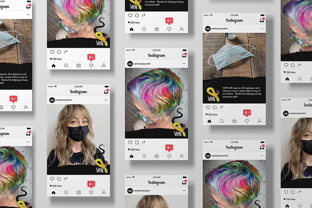
VAIN has expanded to other areas of Seattle, including moving from its original home in downtown Seattle to the Capitol Hill neighborhood, and its edge has dulled. Salons feel neutral while they still produce amazing, cool looks that can be found on their Instagram, and their overall branding isn't cohesive. The goal was to give it a refresh while tying their brand areas together.
Solution
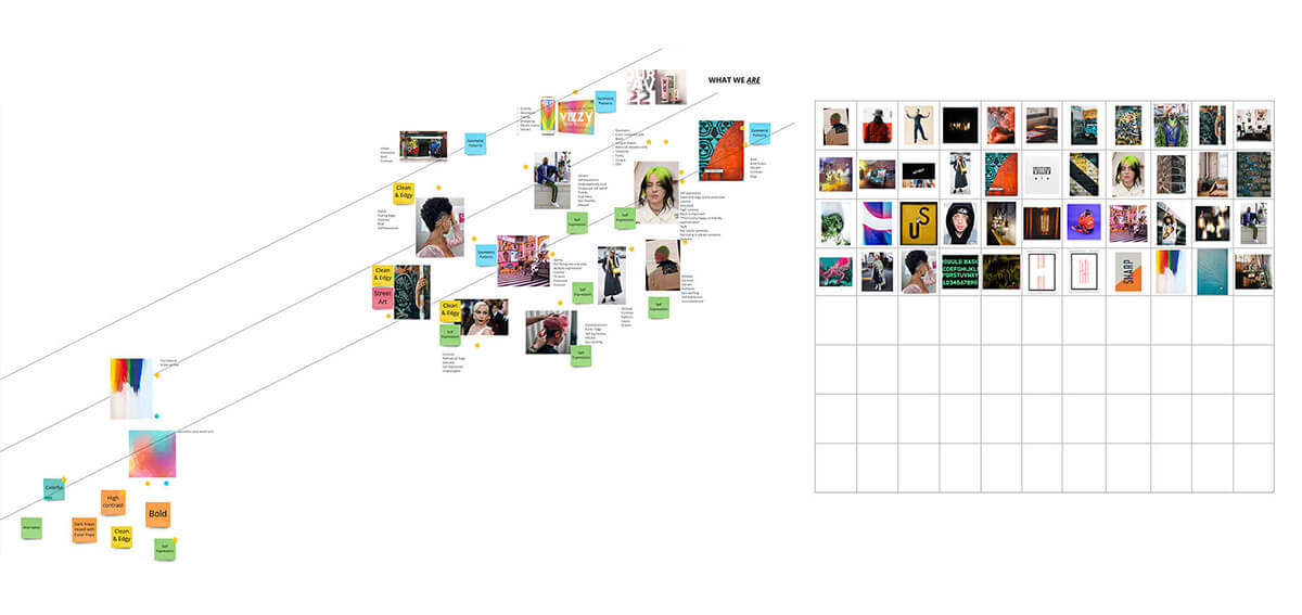
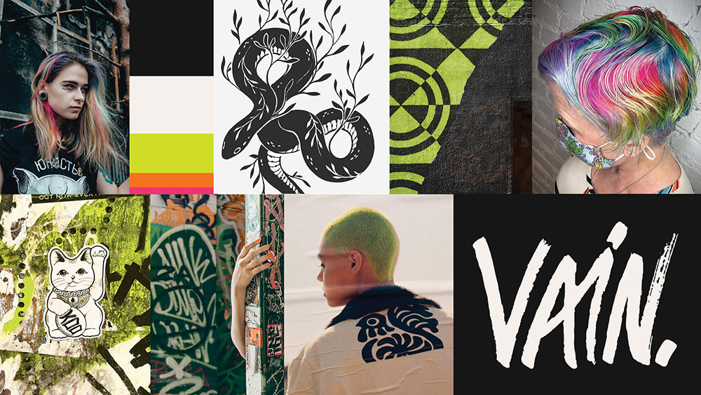
We wanted to bring VAIN back to its grungier urban roots but with a contemporary style to it so it doesn't feel immediately outdated.
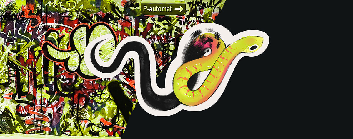
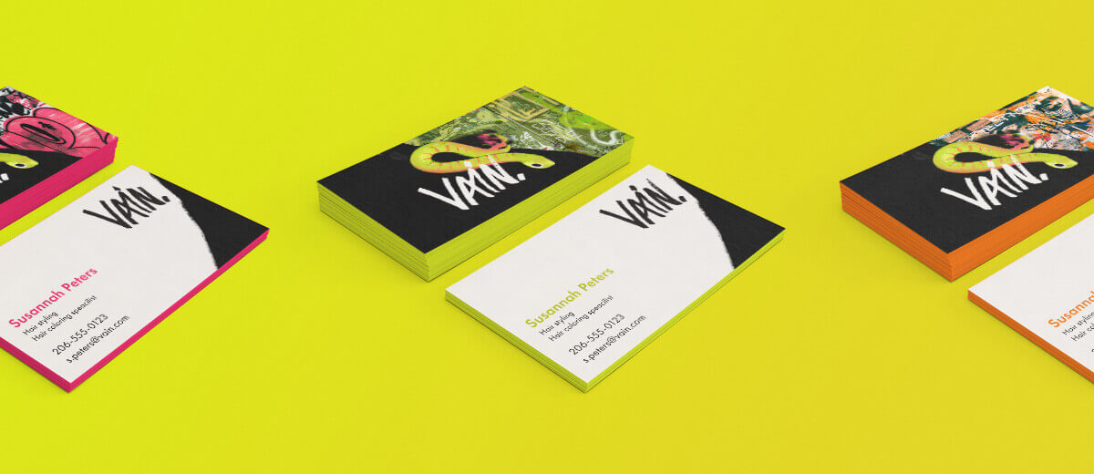
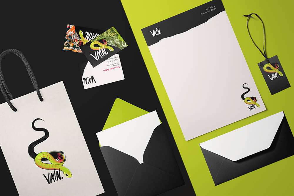
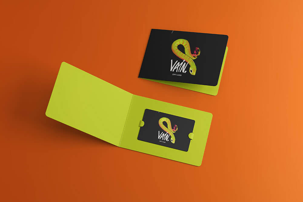
Seattle, like all big cities, has a wealth of graffiti and street art. It's vibrant, bold and full of personality, just like the styles their clientele often want for their hair. With that in mind, it was pitched for the new branding identity to include graffiti art with a block of black covering part of it with a torn edge to help keep marketing materials from becoming too overwhelming.
Deliverables
Logo Treatments
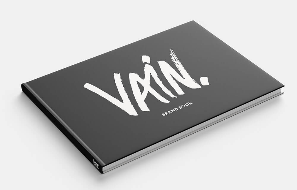
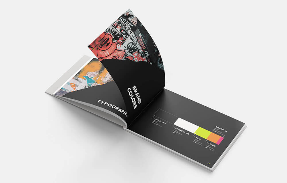
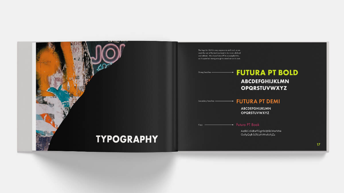
Brand Book
Download a PDF of the brand book (33.6MB)
The Mural
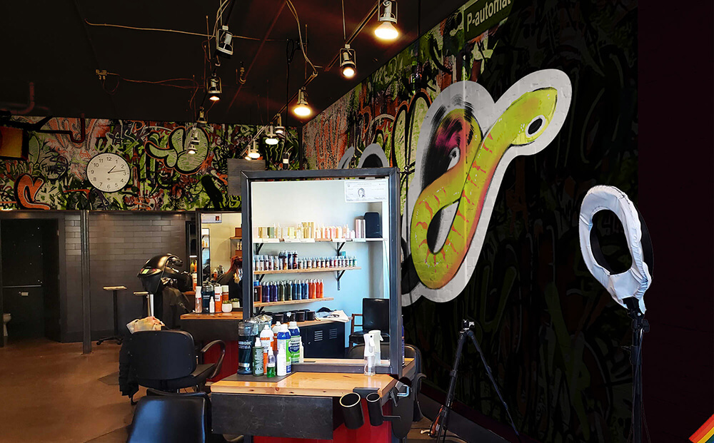
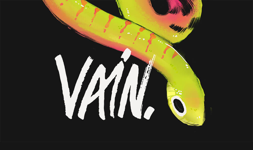
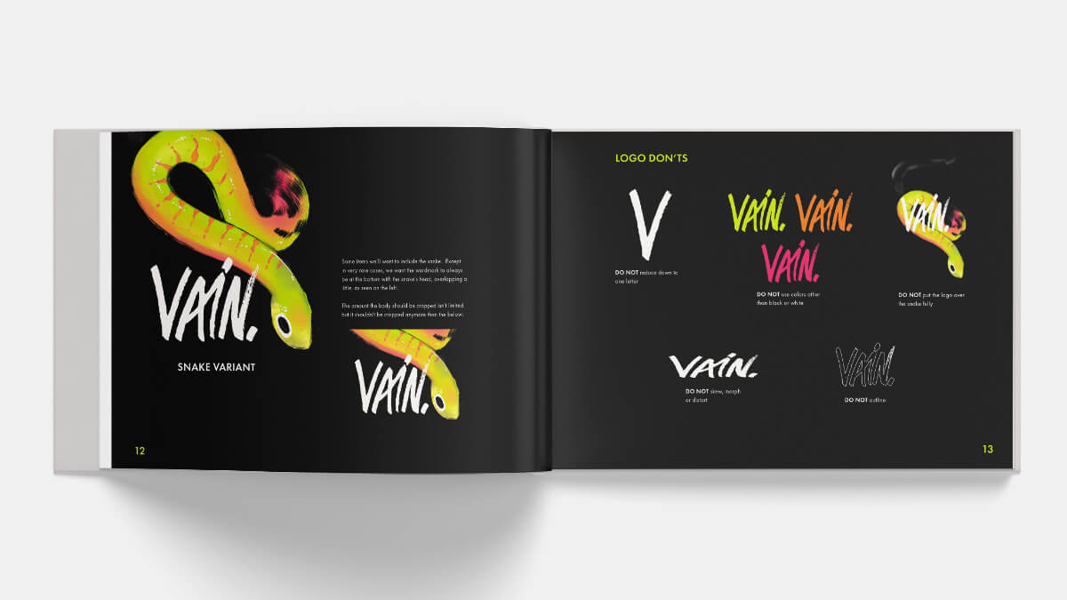
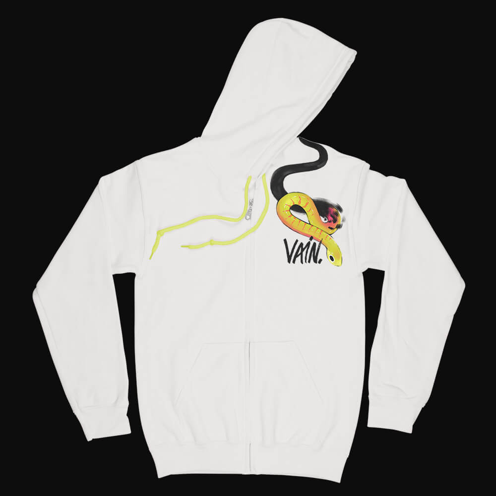
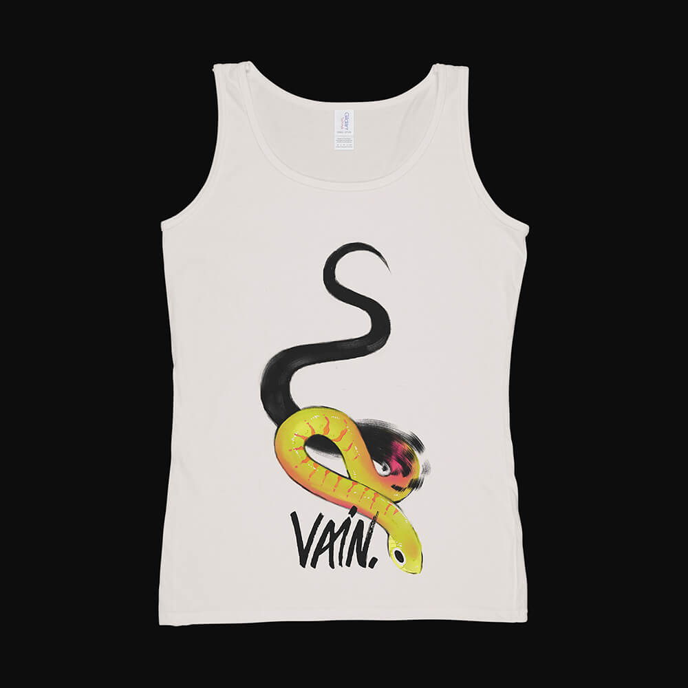
The showpiece of the salon is the wall treatment and mural. Some walls will have a collage of graffiti, commissioned by artists to complete. Other walls will be white and black, meeting in the main wall with the torn edge style. Over the two halves is a snake shedding its "dull" skin, emerging bright and colorful, a metaphor for people leaving the salon with a new style that expresses their authentic self. The snake also doubles as a nod toward sin; being VAIN is considered one, but the friendly eyes and colors of the reptile asserts that wanting to feel like yourself is not a sin.
Clothing
Print Collateral
Online Material
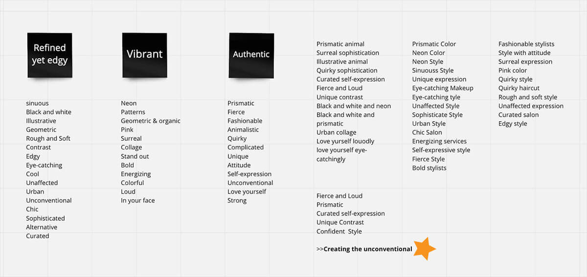
The Process
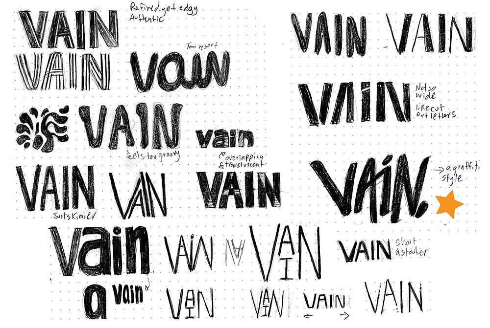
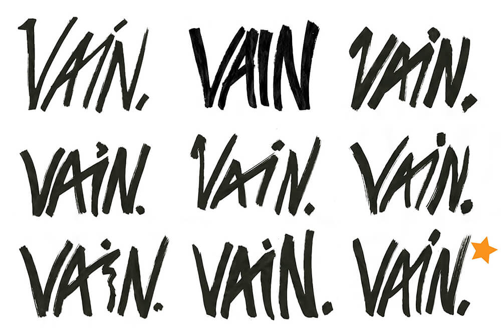
The Logo
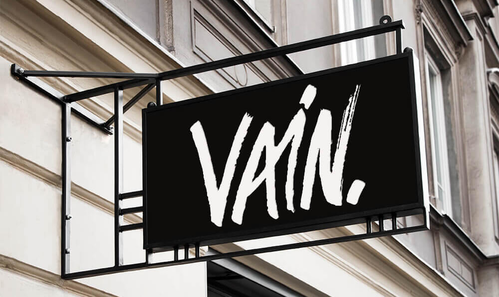
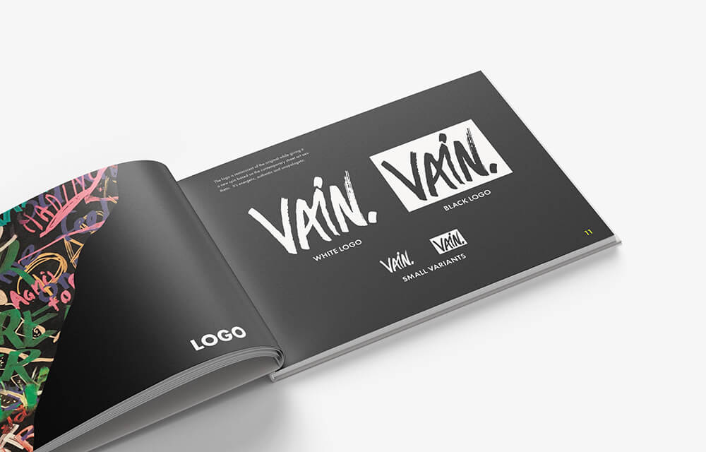
The new logo likewise has been redesigned in a graffiti style, drawn by hand with a paint pen and vectorized.
