Ritual
Overview
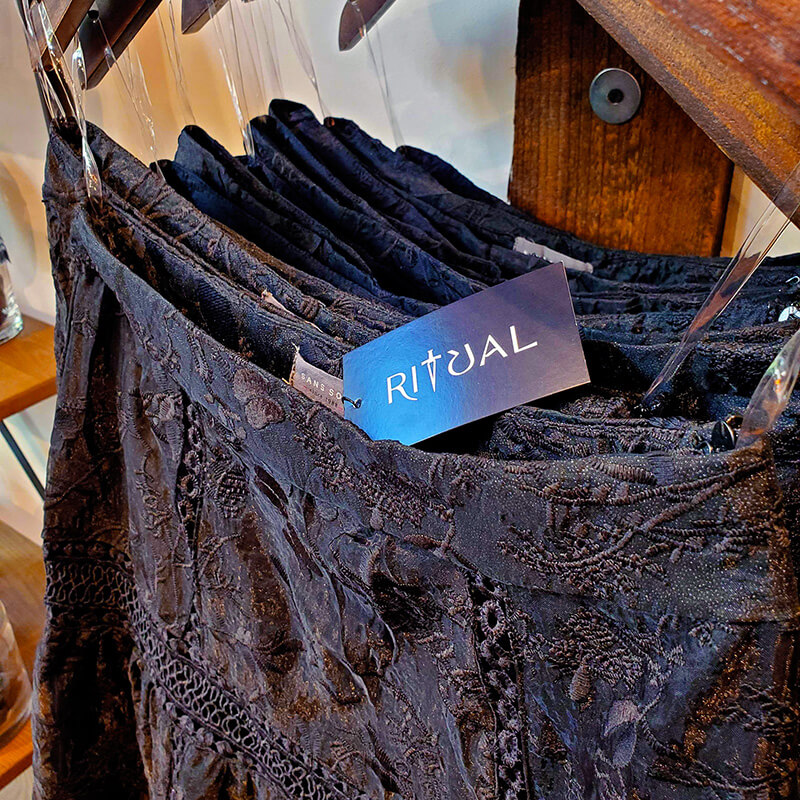
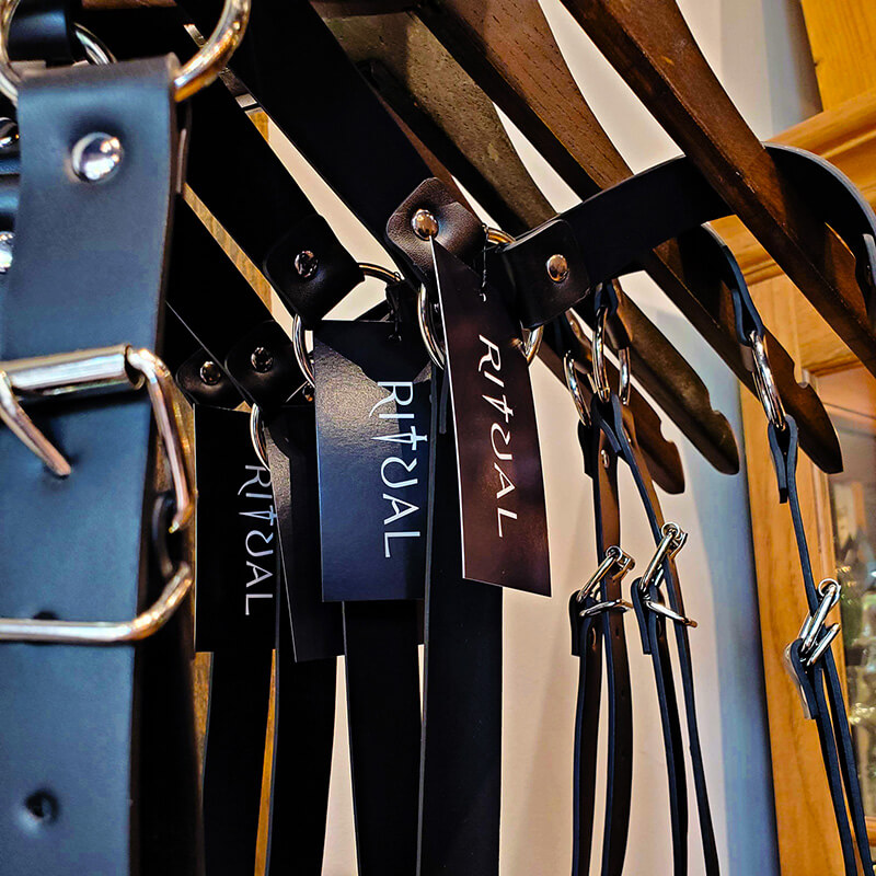
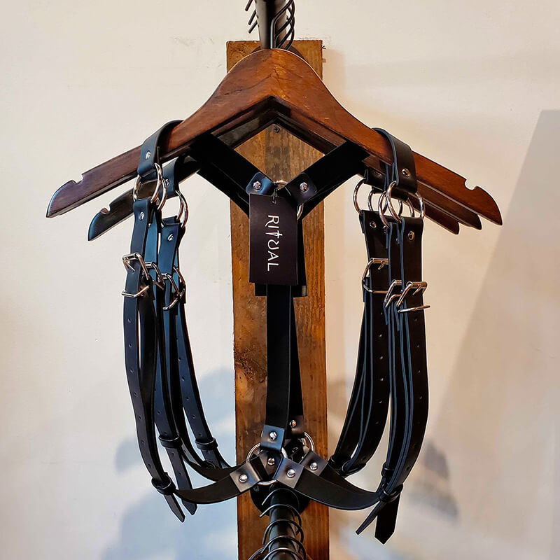
Ritual is a small, Seattle business that calls itself an executive goth clothing store. It's polished, sexy and witchy. They needed help refining their logo and furthering their brand into other design collateral and products.
This is an ongoing project.
Challenge
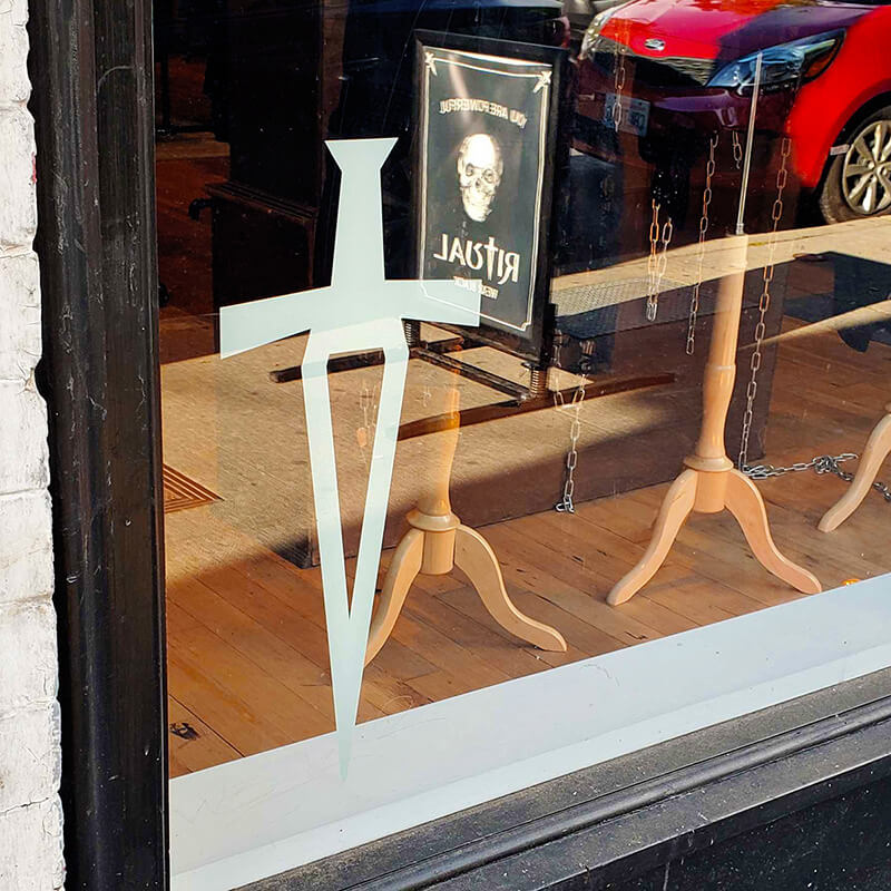
Their logo had seen two revisions previously, and they liked the direction but weren't quite happy with it. Namely, the shape of the dagger, which they wanted to be a focus of their branding, using it on its own for some labels.
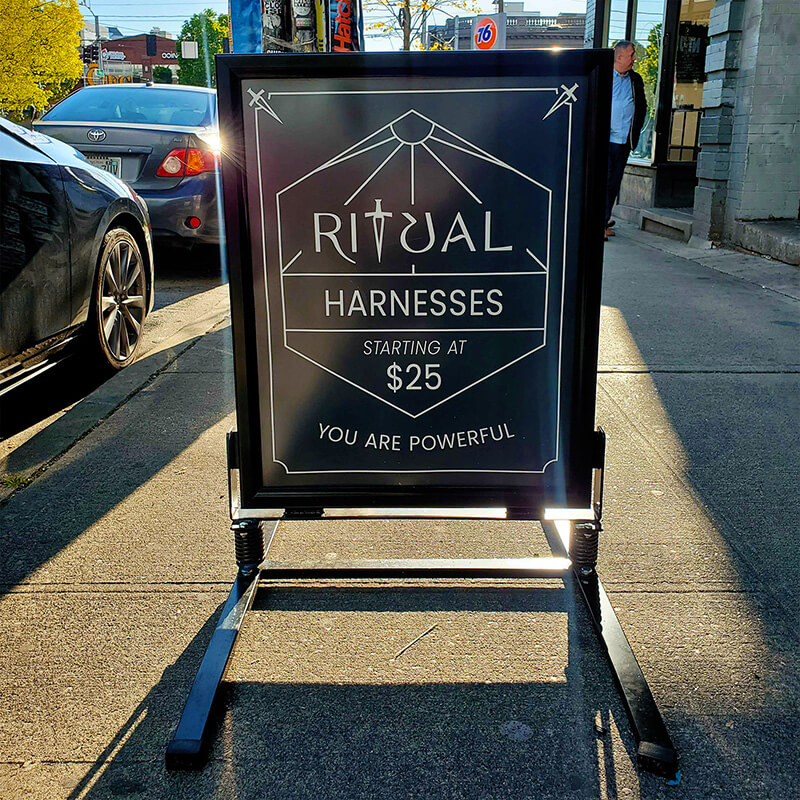
They also needed posters made to put in a frame that sits on the sidewalk outside, luring customers in. I helped them find a style that suited their dark but simple style.
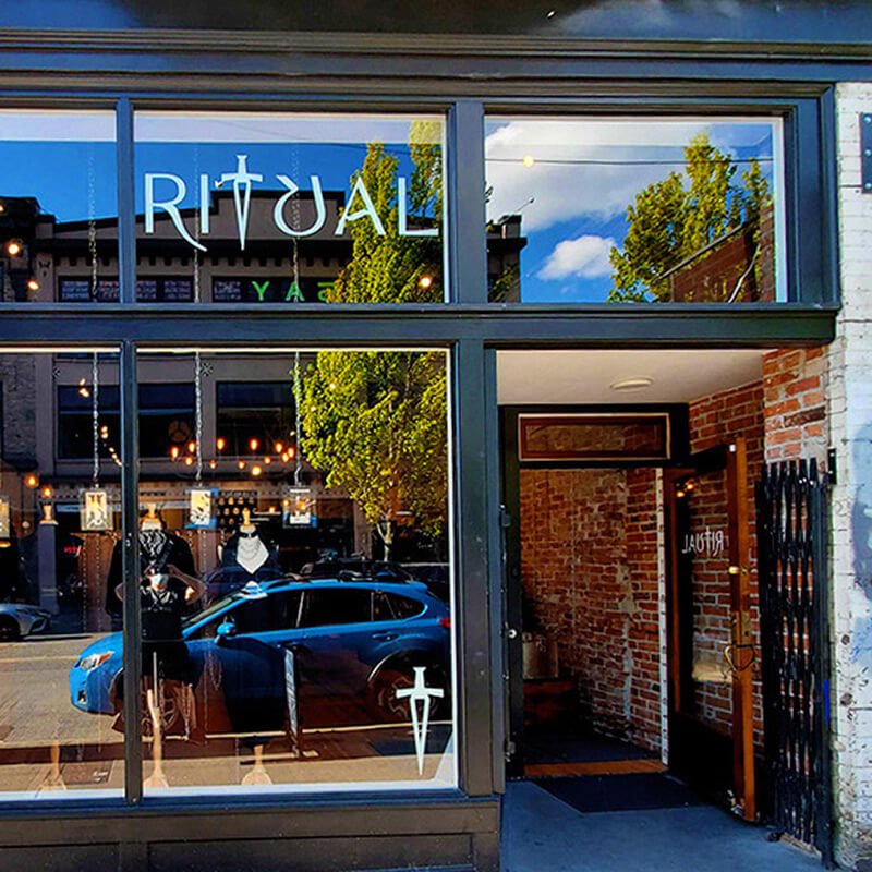
The Logo
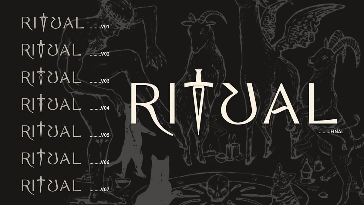
The two pain points for the logo were they felt the kerning was too wide, and the dagger just didn't feel right. The first thing I did was tighten up the letters, adjusting the leg of the R to help achieve this.
The dagger itself had many options for them to consider, and in the end, they went with a silhouette similar to the original, but thinner. We had determined with small alterations, it was a good, recognizable shape.
The Posters
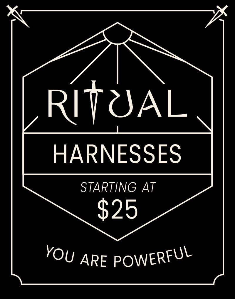
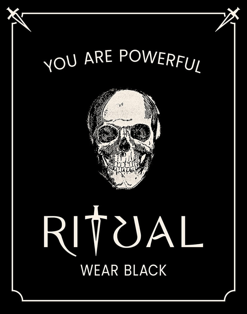
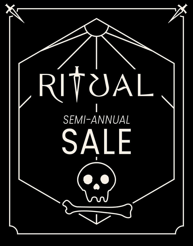
They wanted the posters to be clean and simple but still able to catch the eye as someone walks toward them. While the main poster has a detailed skull illustration, the overall style is purposefully stark and minimal: the message on the posters should be seen first, so we prioritized typography over ornamentation.
The linework is evocative of playing or tarot cards, with the added benefit of leading the viewer's gaze to important information. Any new illustrations, such as the skull and bone on the sale poster (an alchemical symbol for the leftover remains of a process), are to be in a minimal style.
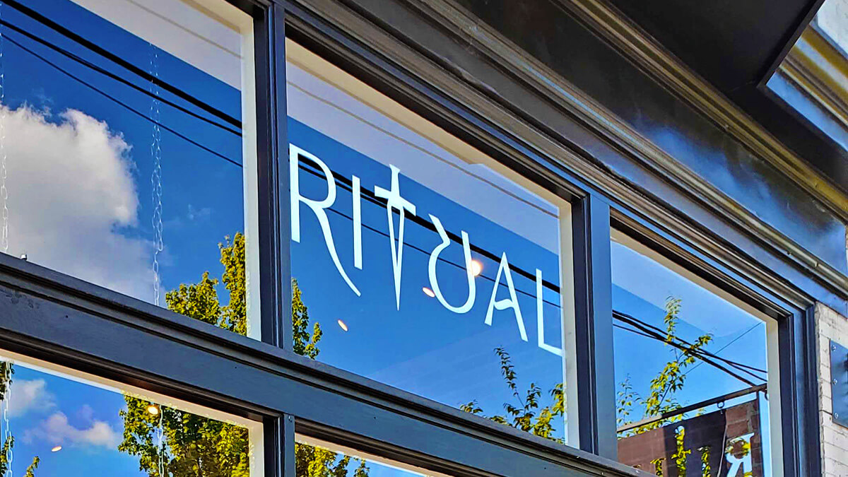
In Use
Social Media
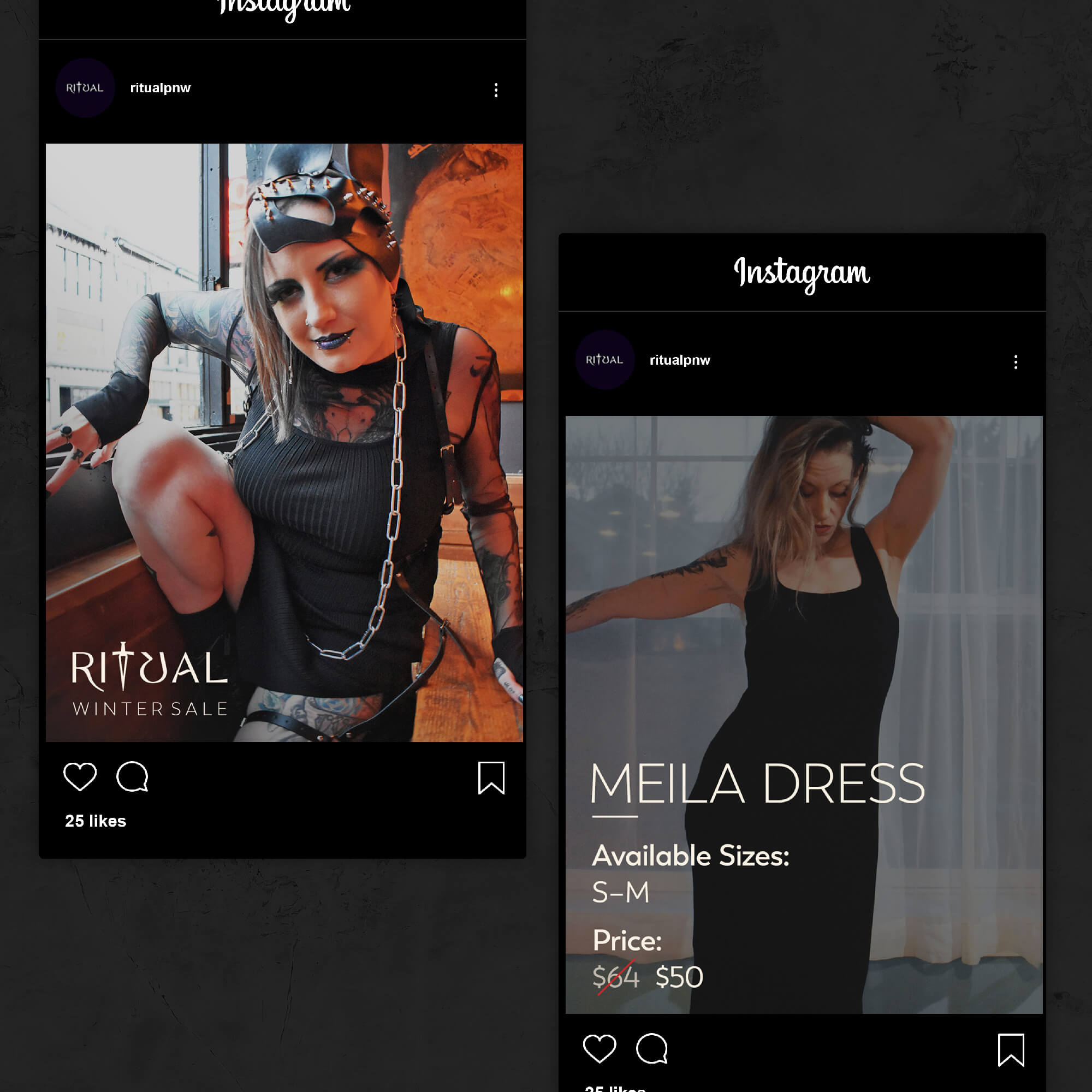
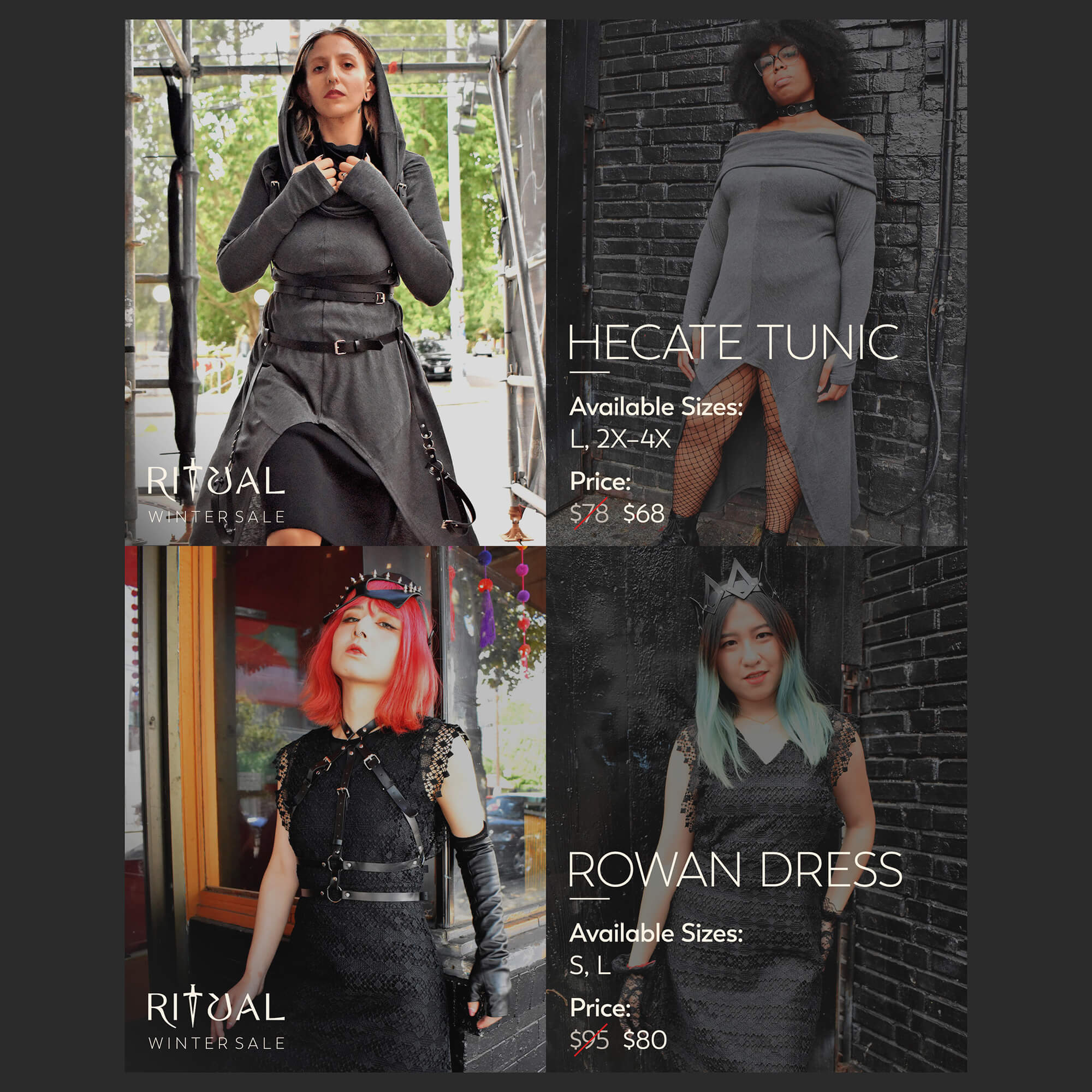
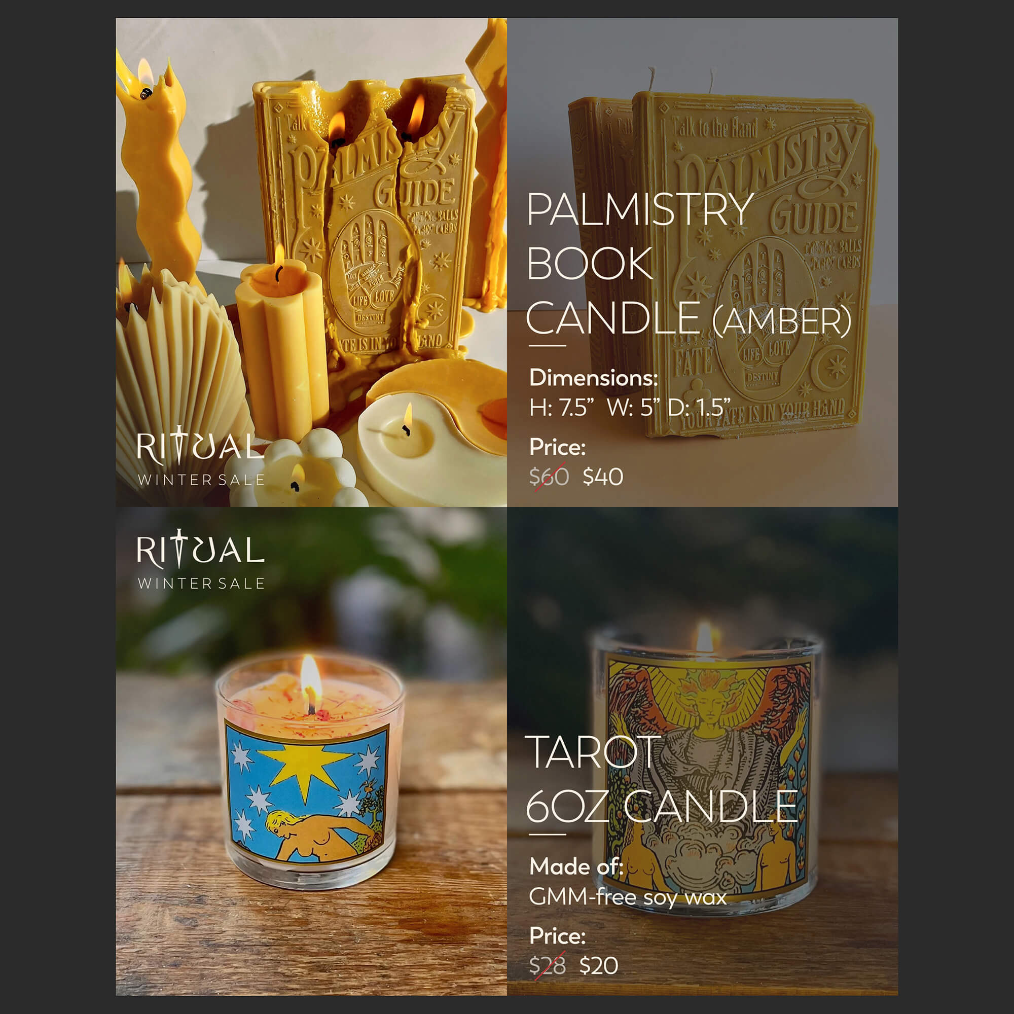
For the big winter sale, we wanted to create social media images that would catch eyes while being informative, but we also needed them to be used across different platforms: Instagram (posts and stories), Facebook and Tumblr. There wasn't time or budget to make unique posts between them all, so a solution was needed that would work well across them.
With Instagram, stats seemed to point to having a good image with minimal text that people will then swipe through, while other platforms like Tumblr post all images in one go. What I came up with was to have an opener with an attractive photo and the store logo, then a secondary image with a new image, but faded with copy on top of it giving pertinent information. This way, on Instagram people can swipe through, while on other platforms people can view it linearly.
This pattern I designed became recognizable to viewers scrolling through feeds, and there were noticeable click throughs to the products with sales resulting from them.