High Strangeness Magazine
Overview
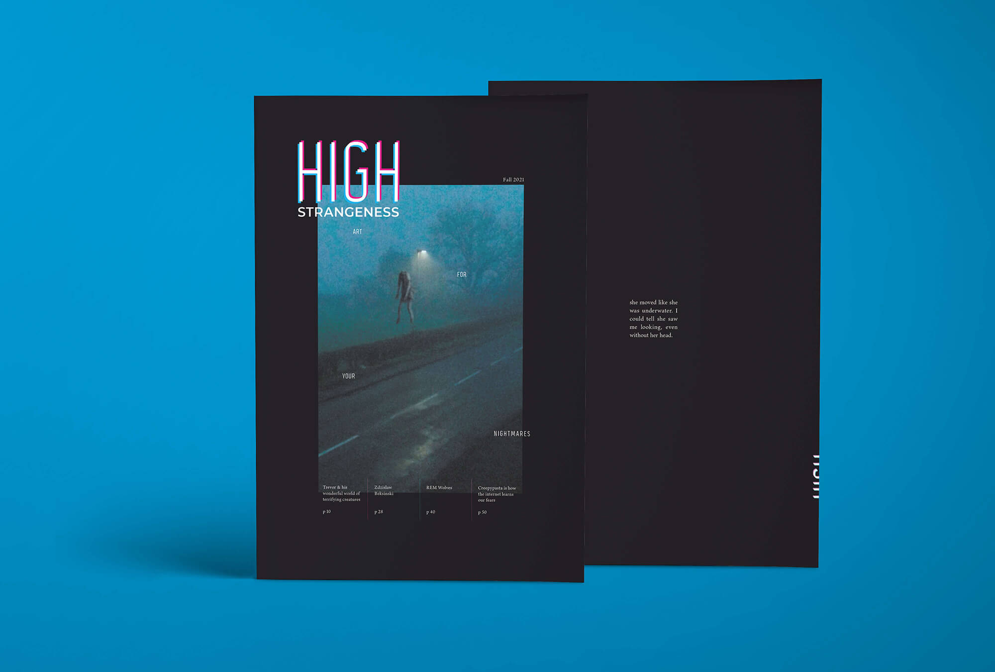
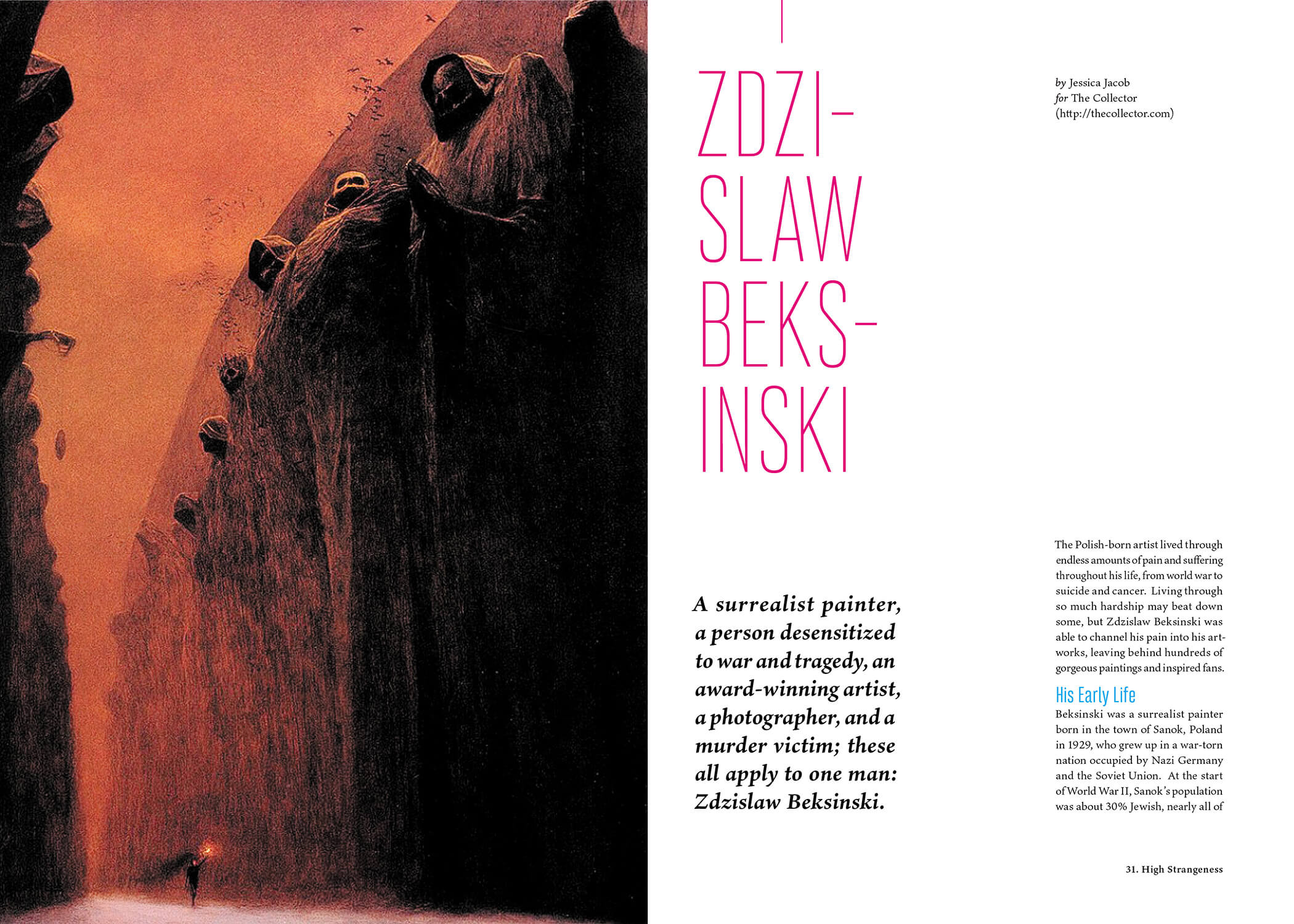
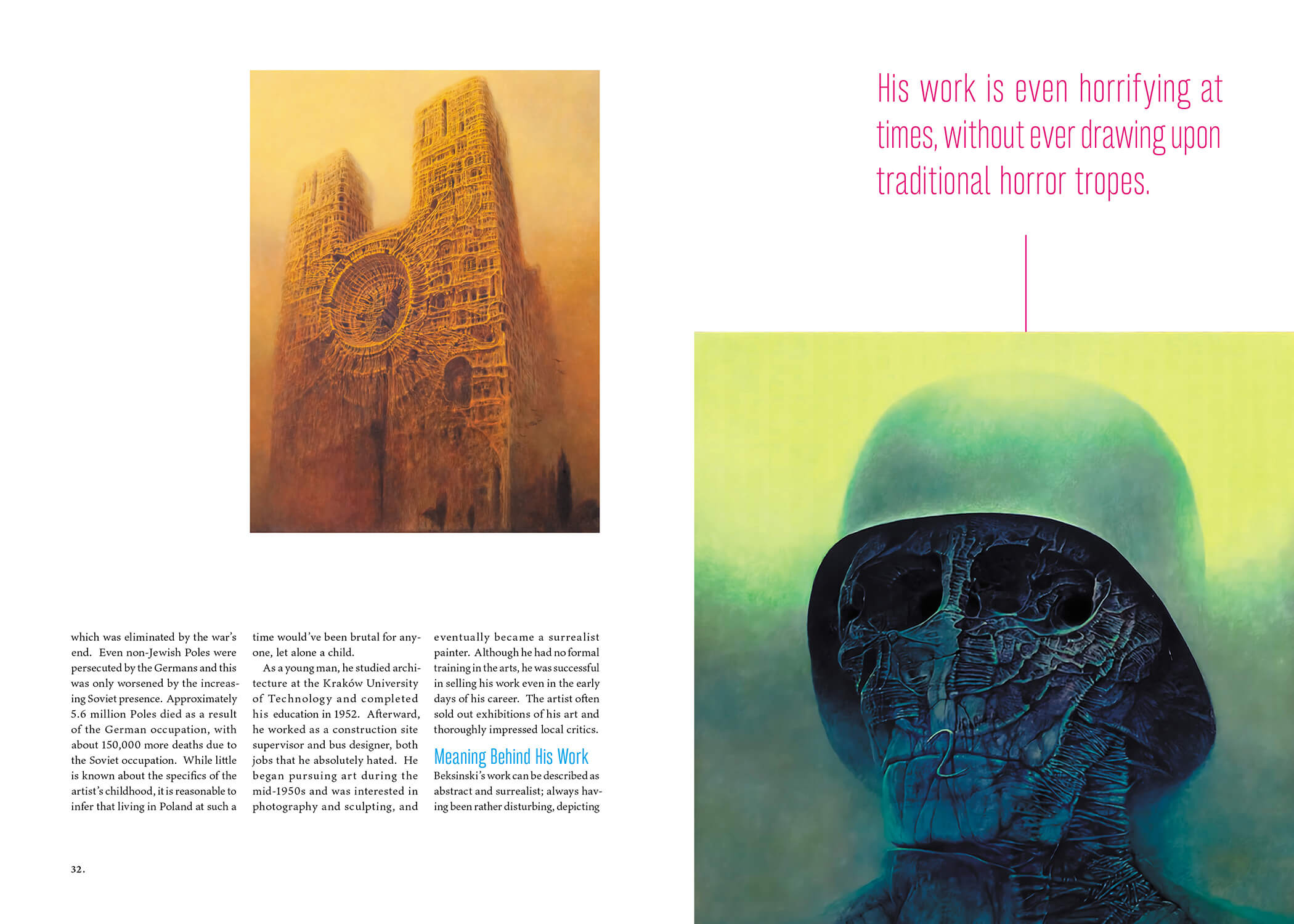
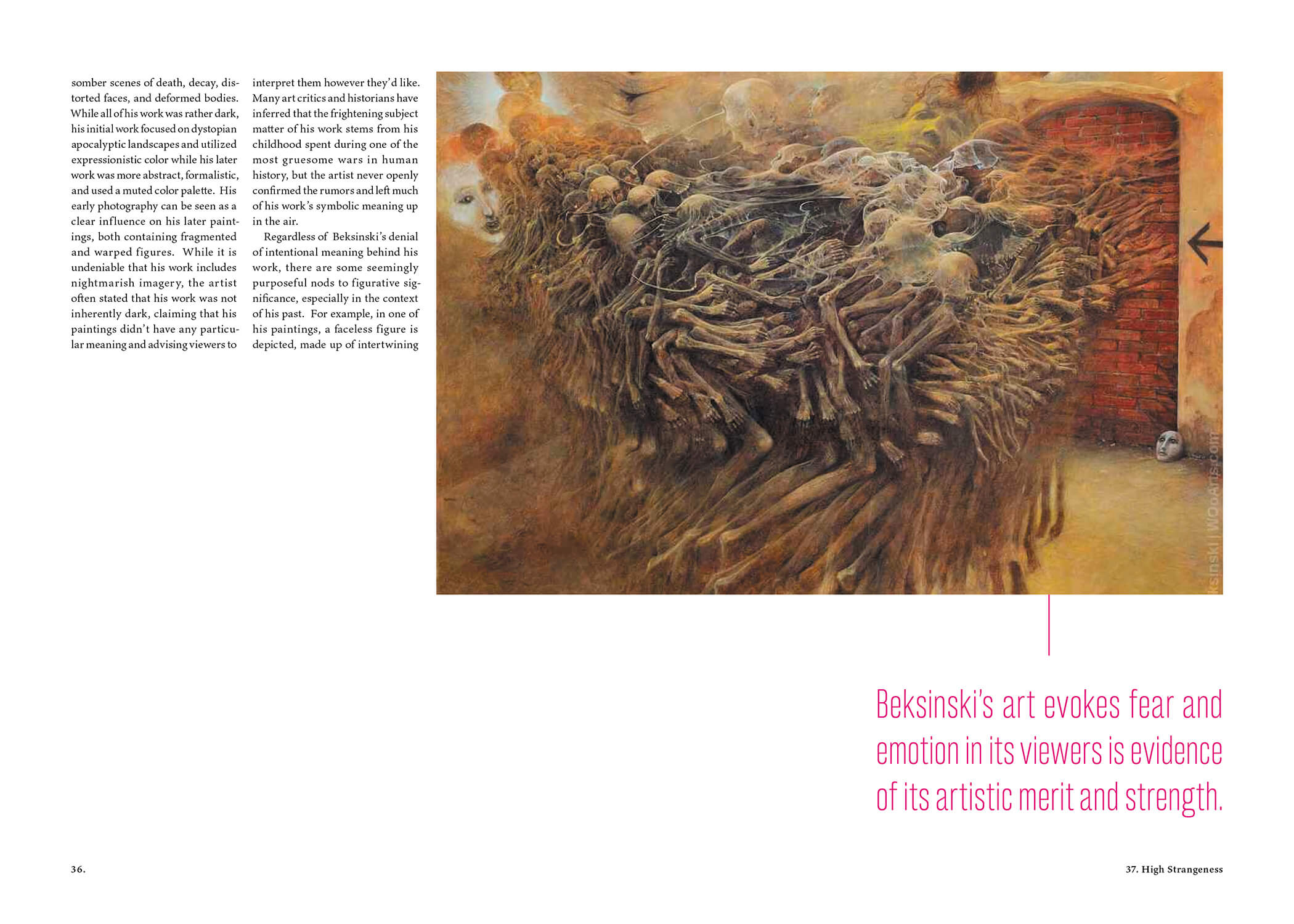
High Strangeness is a magazine featuring art, writing and articles for an audience who is into horror that's surreal and unsettling. The content isn't about gore or cheap scares, its goal is to intrigue you — haunts you.
Challenge
High Strangeness is a genuine celebration of this particular genre of horror. It's popular on the internet, influencing art, video games, TV and movies, and writing (especially in the form of creepypasta). The magazine keeps those fans and creators in mind, but was also designed to likewise intrigue a casual passerby to pick it up.
Solution
I curated specific artworks, writings and articles that best suit the genre for this hypothetical inaugural issue. To add subtle tension to the reading experience, the layout uses changing column positions, number of columns per page, swathes of empty space, or sudden, disquieting large text.
Mockups
Spreads
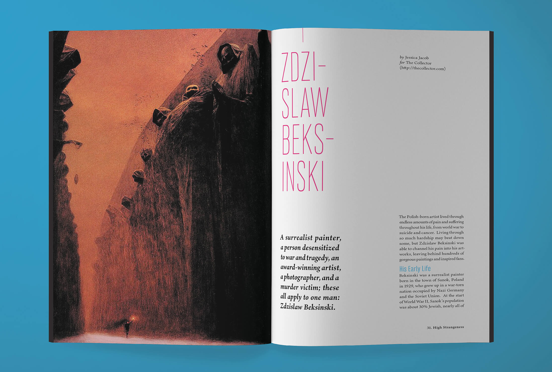
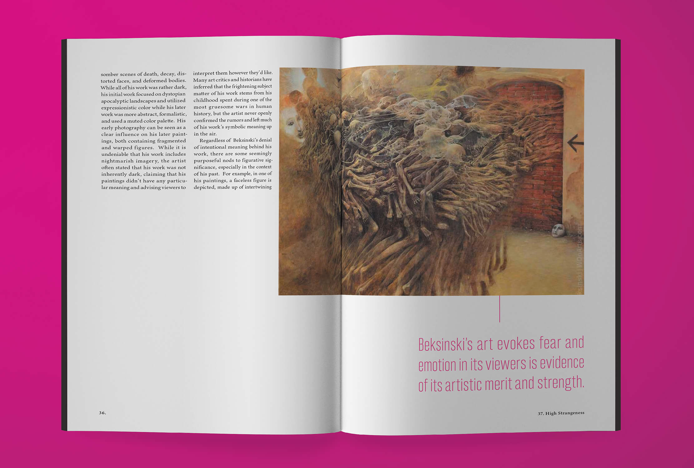
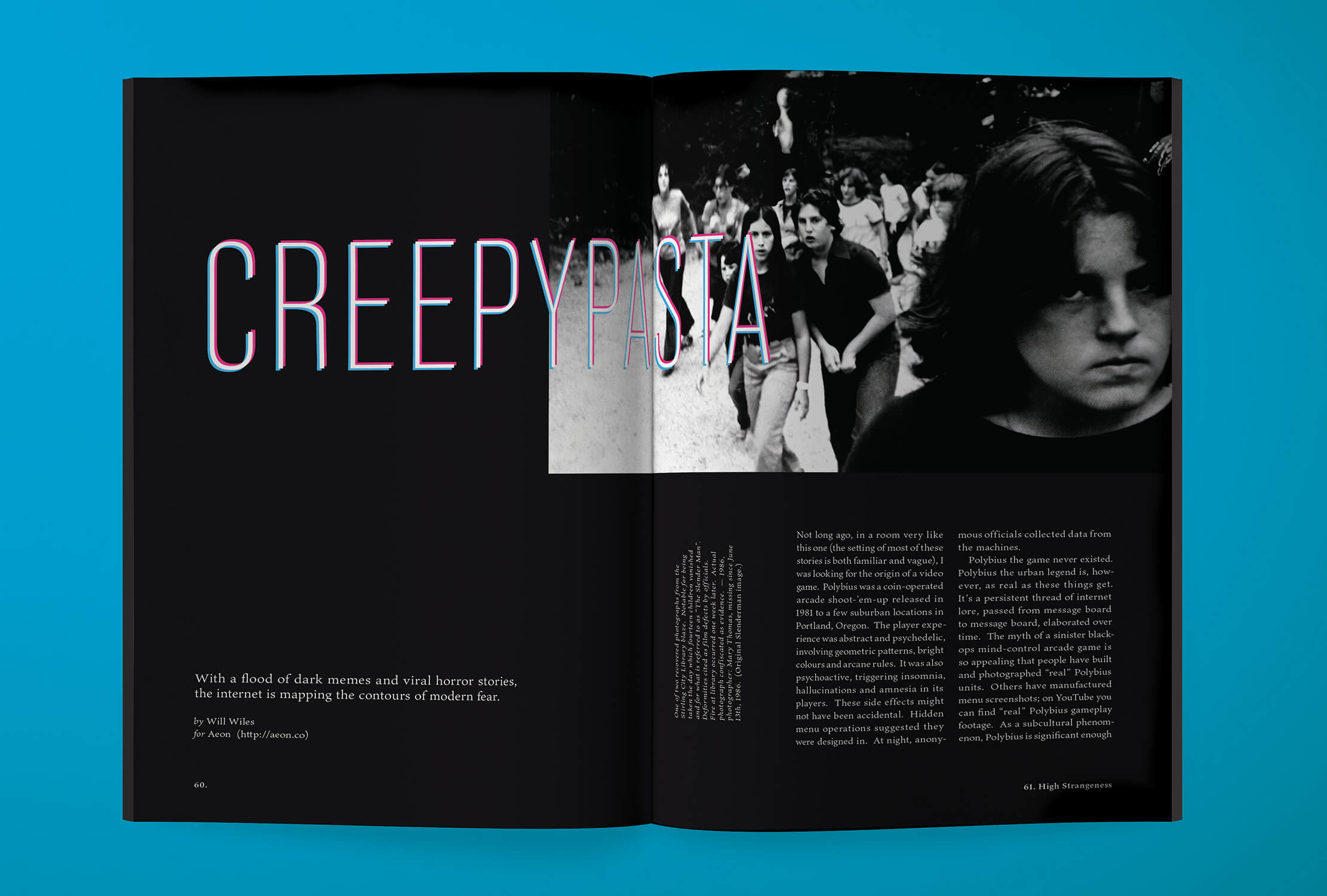
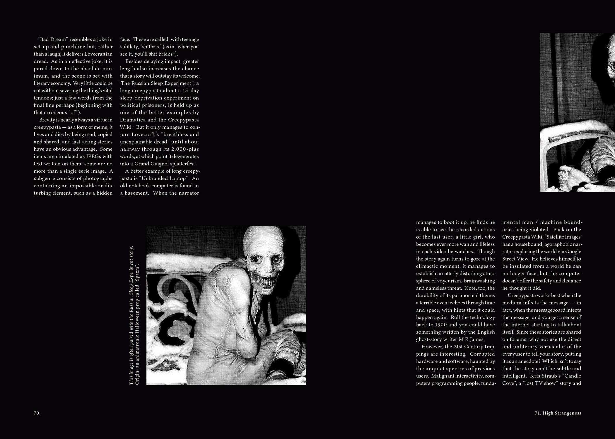
Here are some example spreads using a couple articles and public domain art and images. If you'd like to see the entire magazine, please get in touch with me!
The Process
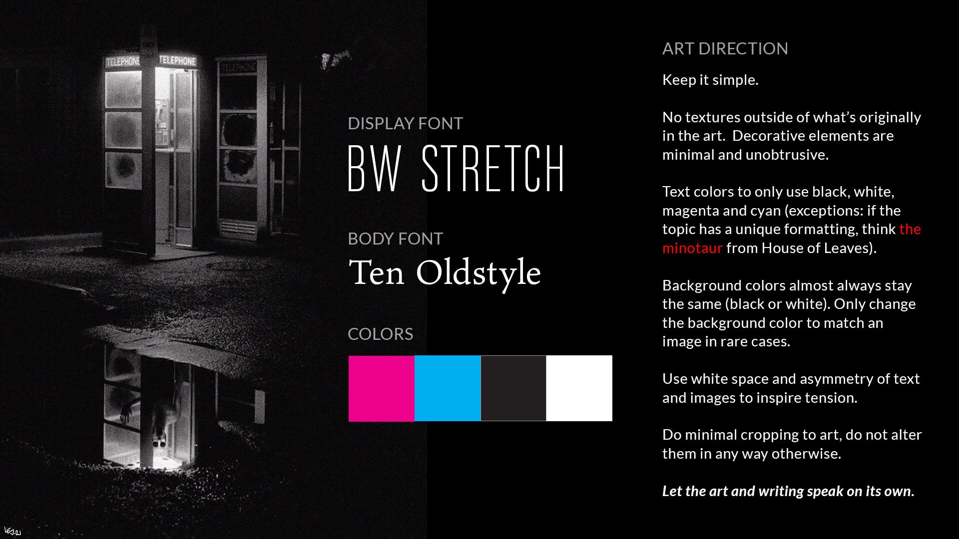
Visual Style
The overall style of the magazine is purposefully simple in order to let the art speak on its own. Deviations from the color of the background or text is handled on a rare case-by-case basis.
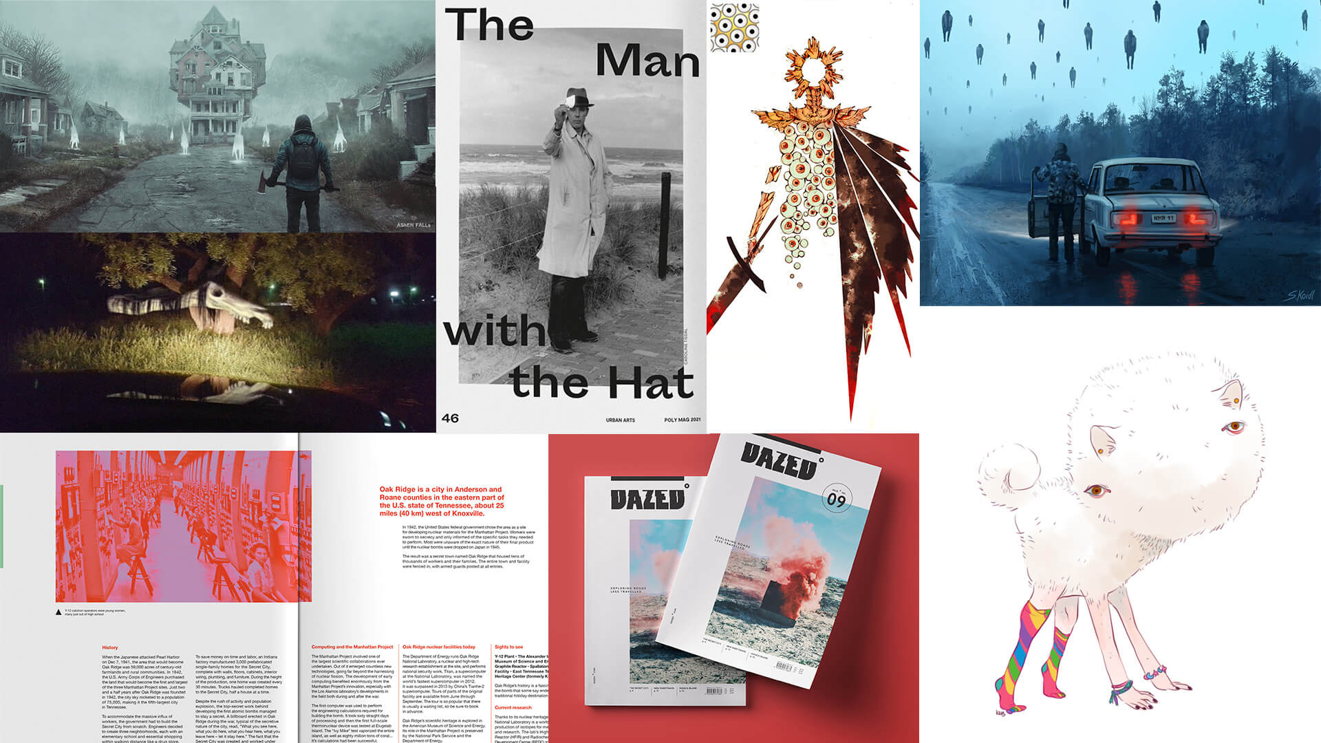
Art Credits for the Moodboard
From left to right, top to bottom.
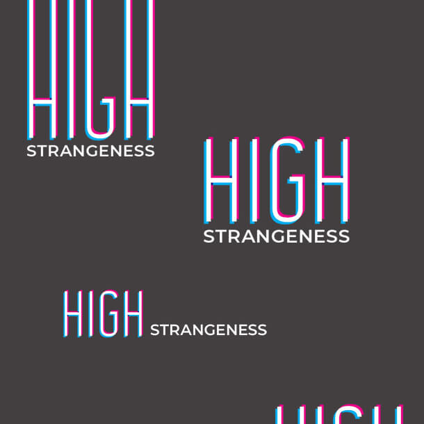
Logo
A simple wordmark was created for the magazine masthead by using a faux-retro 3d effect with magenta and cyan (instead of the typical red and blue). The vibration it gives the viewer's eye is strange and unnerving to match the tone of the content of the magazine.