Costco
Overview
Costco's e-commerce marketing department was looking for someone who could do HTML/CSS but also do design work, and I was hired to fill that niche role.
I worked on various projects, both short term and long term, creating enticing banners for products to redesigning and coding long-term campaign assets. My knowledge and expertise was sought to pitch ideas that could affect the entiriety of the site, or by other departments to help solve front-end development issues.
While in this role I also learned new, important skills like beefing up my accessibility knowledge or navigating a ContentStack, a CMS I had never worked in before.
Deliverables
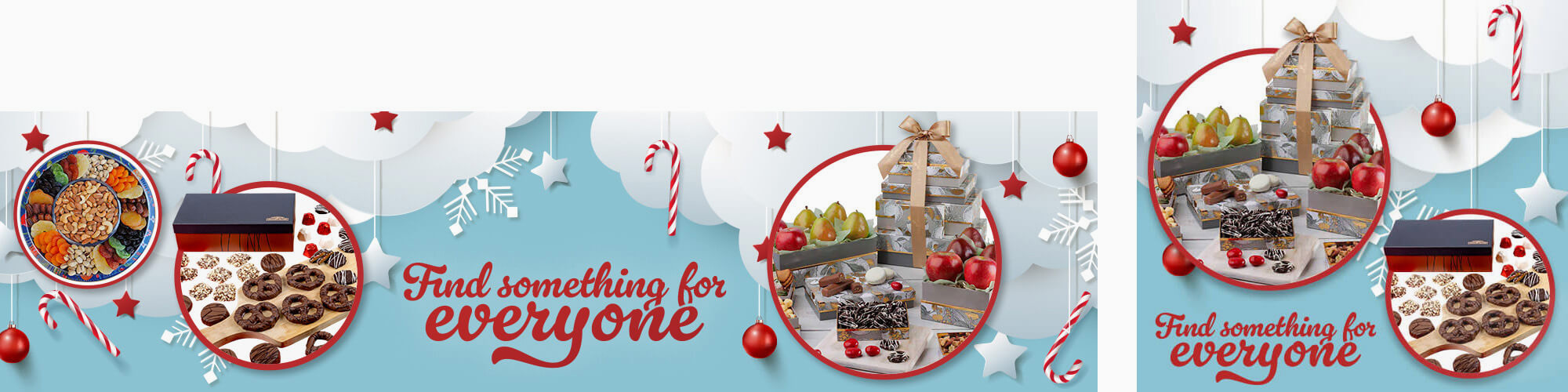
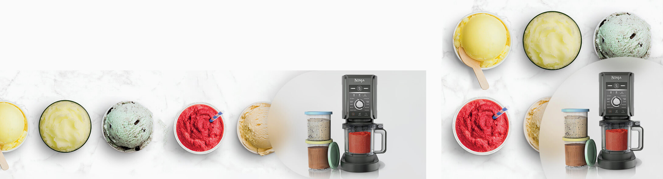
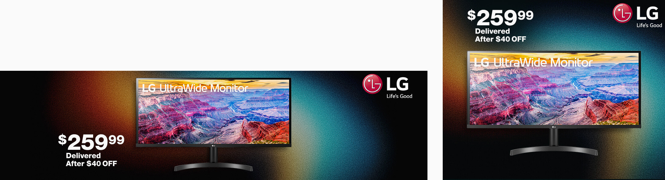
Graphics
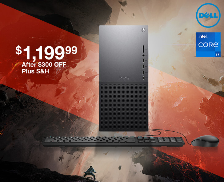
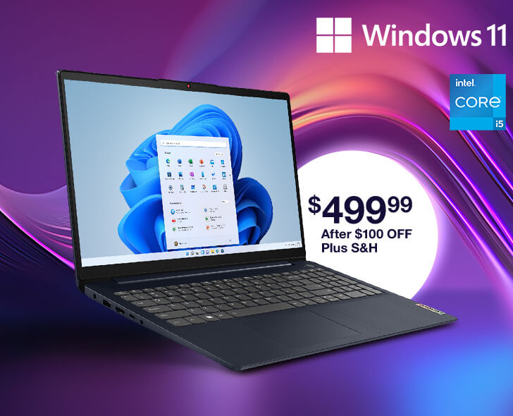
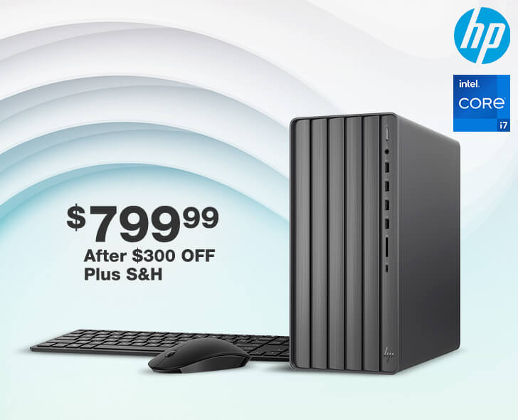
One of the core duties in the e-comm marketing department is creating banners for all the various showcased products. With a high turn over, it's a challenge to create designs that aren't utterly repetitive and also fit the vibe of the product. When they were scheduled together, we would try to tie similar products together with similar backgrounds, which can be seen in some of the below examples.
Some banners had two versions, one for larger screens, one for smaller screens.

Design & Coding
I was in charge of various long term projects that included both UX design and front-end coding. Here are some examples of released projects.
Why Buy Homepage Component
One particular product pages, like appliances, televisions, etc, there were small banners stating why you should buy this product from Costco with a list of 4 perks. They wanted to expand on this idea with a homepage component that would highlight 5 product categories. I came up with a card layout solution that stood out from the rest of the content on the homepage, with slight hover animations to attract attention of someone incidentally hovered over a card.
This component proved very successful, and several more departments came forward wanting to be added to it. This created a problem where the component would grow too large. The solution that I proposed and was accepted was a javascript solution where on large screens the info is in a tab-panel interface, and on mobile it's in an accordion. With this component, more departments can be added with minimal impact--in fact, as I type this, I'm working on adding two more!
This component continues to bring in more traffic to these departments or their reward calculators, and has been called out numerous times as a success story in company meetings and documents.
Costco Direct Table Component
Costco has a campaign where the more you buy certain products under the Direct promotion the more you save. Their original table was just an image:
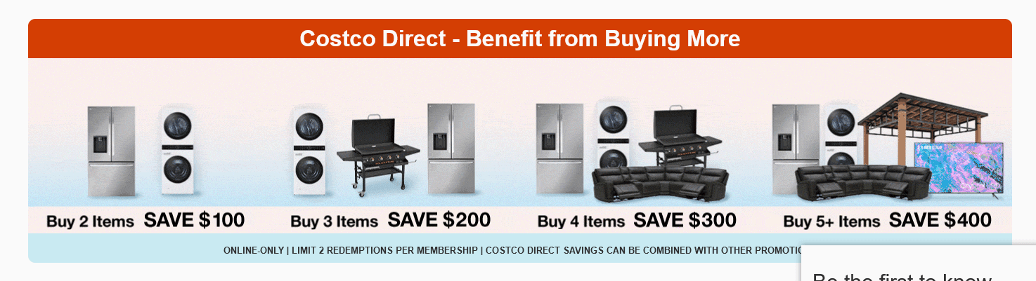
I approached the redesign with a similar layout, but more readable and cleaner to make the information less confusing. Different colored columns and graphic bugs to help separate the infromation helped to promote this campaign to customers and bring more click throughs. The compnent is also used on category pages and in emails, albeit altered to work in most inboxes.