Broan-Nutone
Overview
A complete e-commerce refresh for a storied company created in the '30s.
Challenge
The client came to the company I was working for wanting to do an overall of their website. To them it felt outdated, not user-friendly or easy to navigate, and the mobile version needed work as well.
Solution
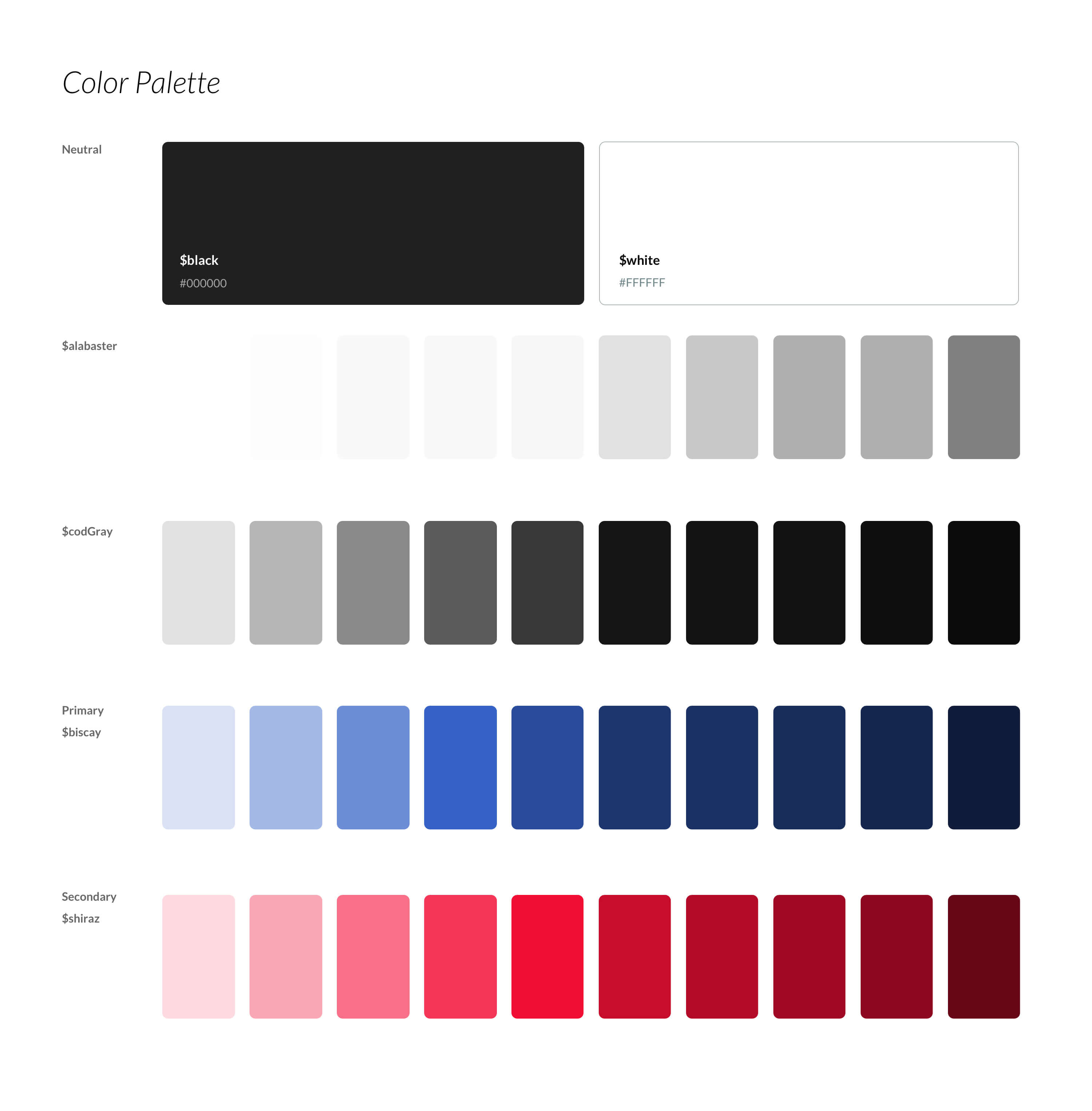
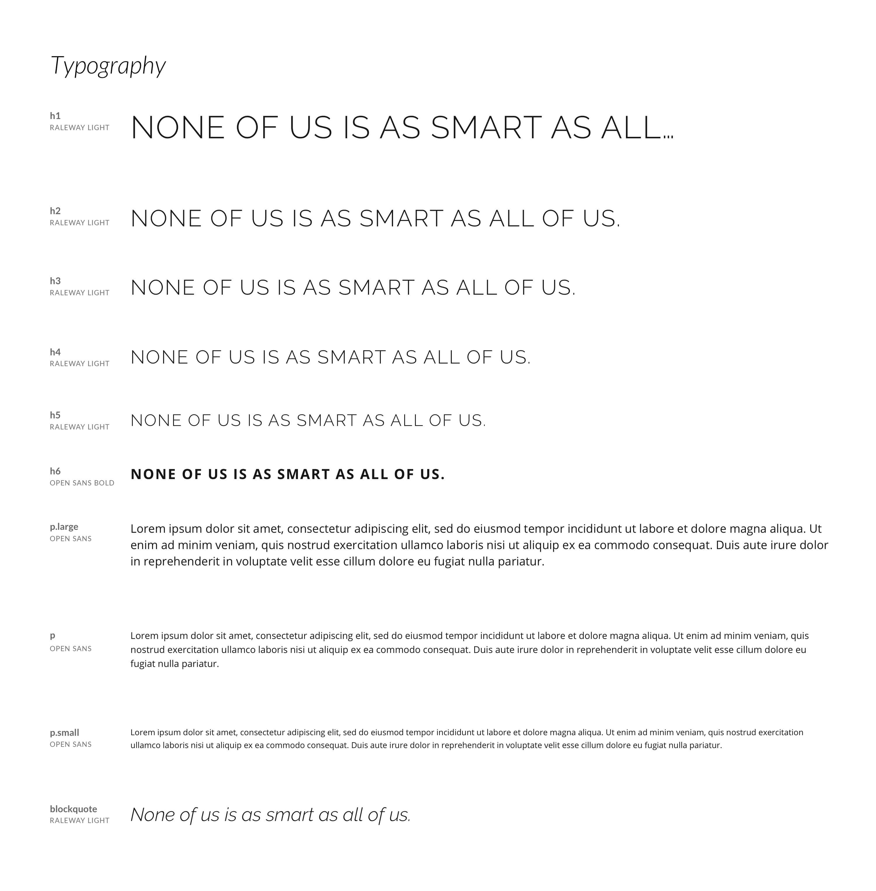
We pitched to them a website rebrand that kept to their white and clean aesthetic while giving it a slightly more lux feel with choice of fonts and design elements.
I was the lead designer on this project, coming up with the overall style direction and designing out all the components the website would need.
Deliverables
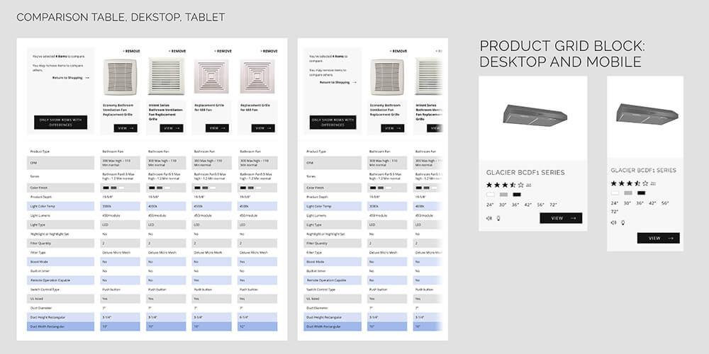
Comparison
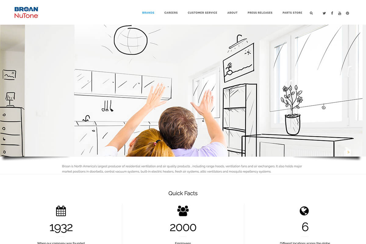
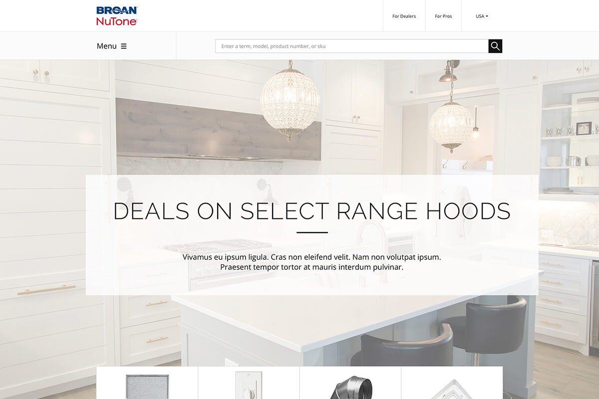
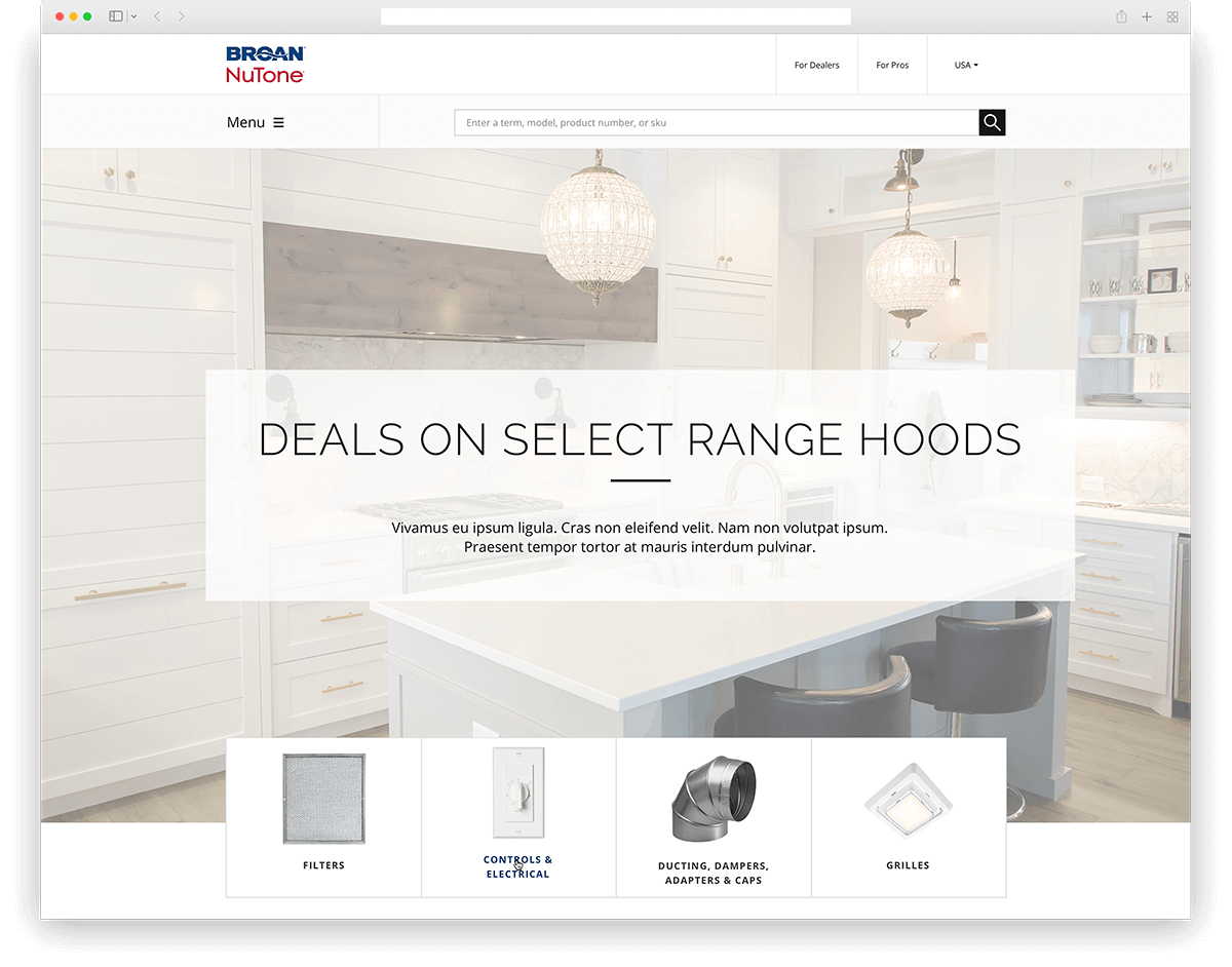
Homepage

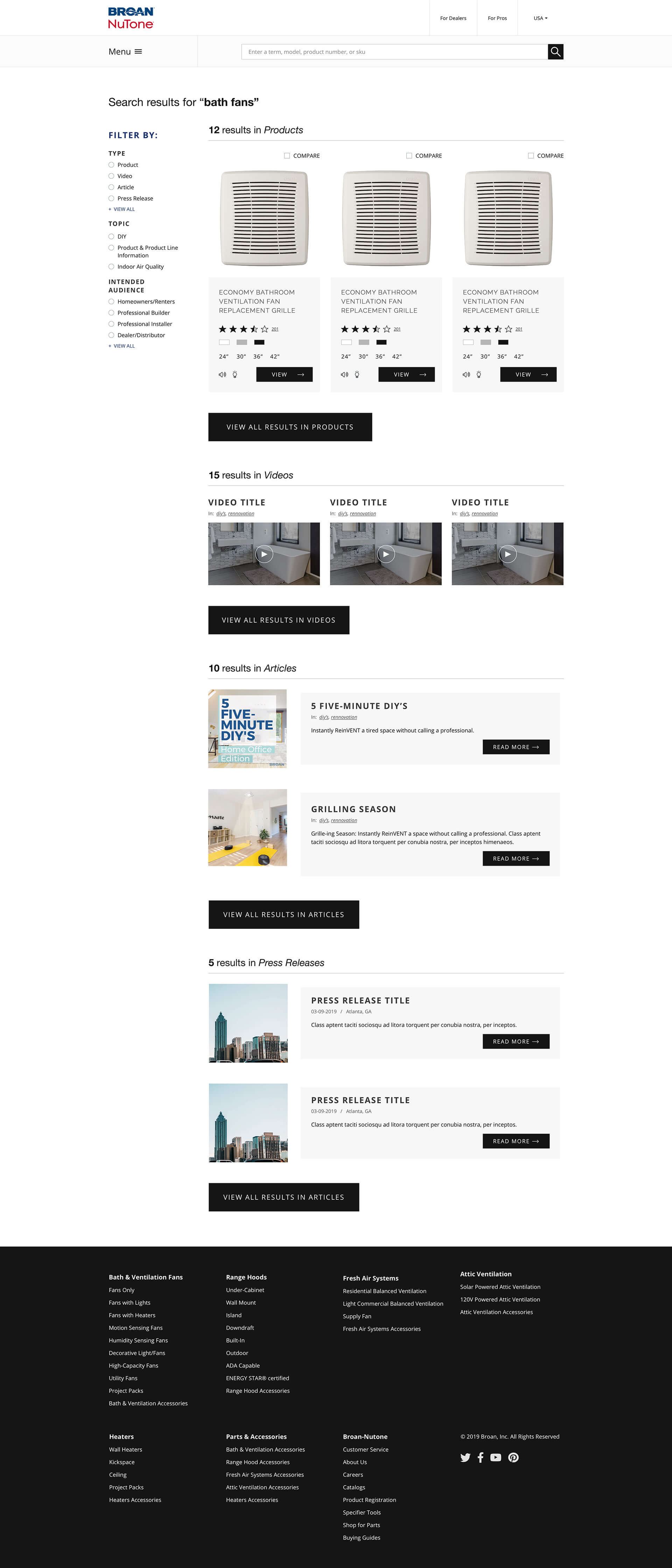
Search Results
Basic search would return any result from the site, this mock-up was to show what result for each section would be.
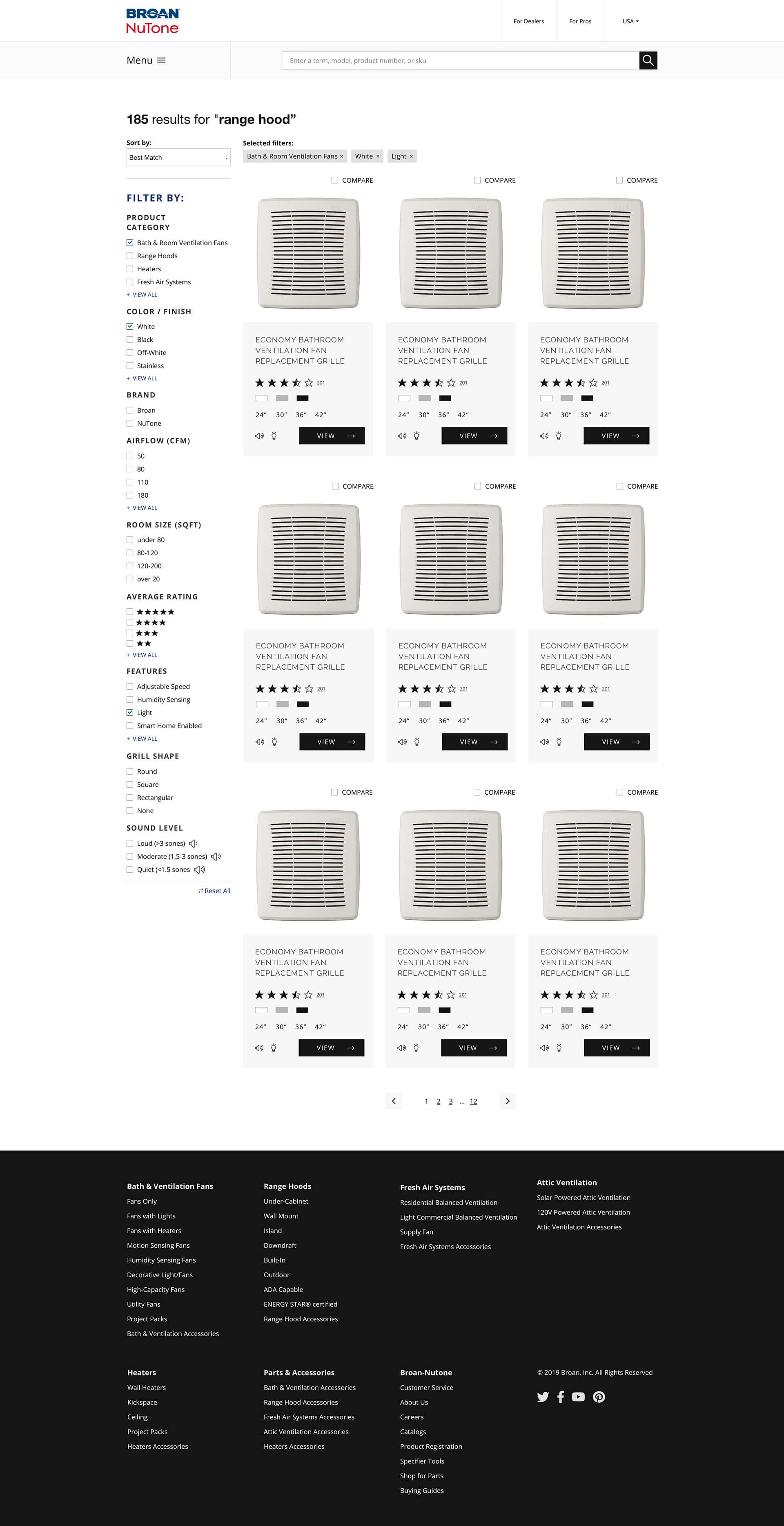
Products Filtering
When going to a collections landing page, products can be narrowed down using an in-depth filtering system.
Categories Landing Page
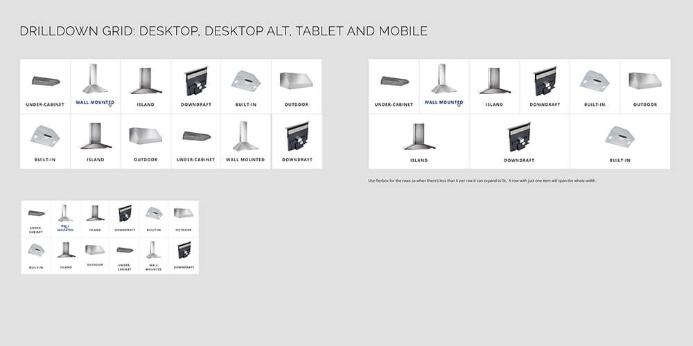
Mock-up of the categories landing page with all the options created for it.

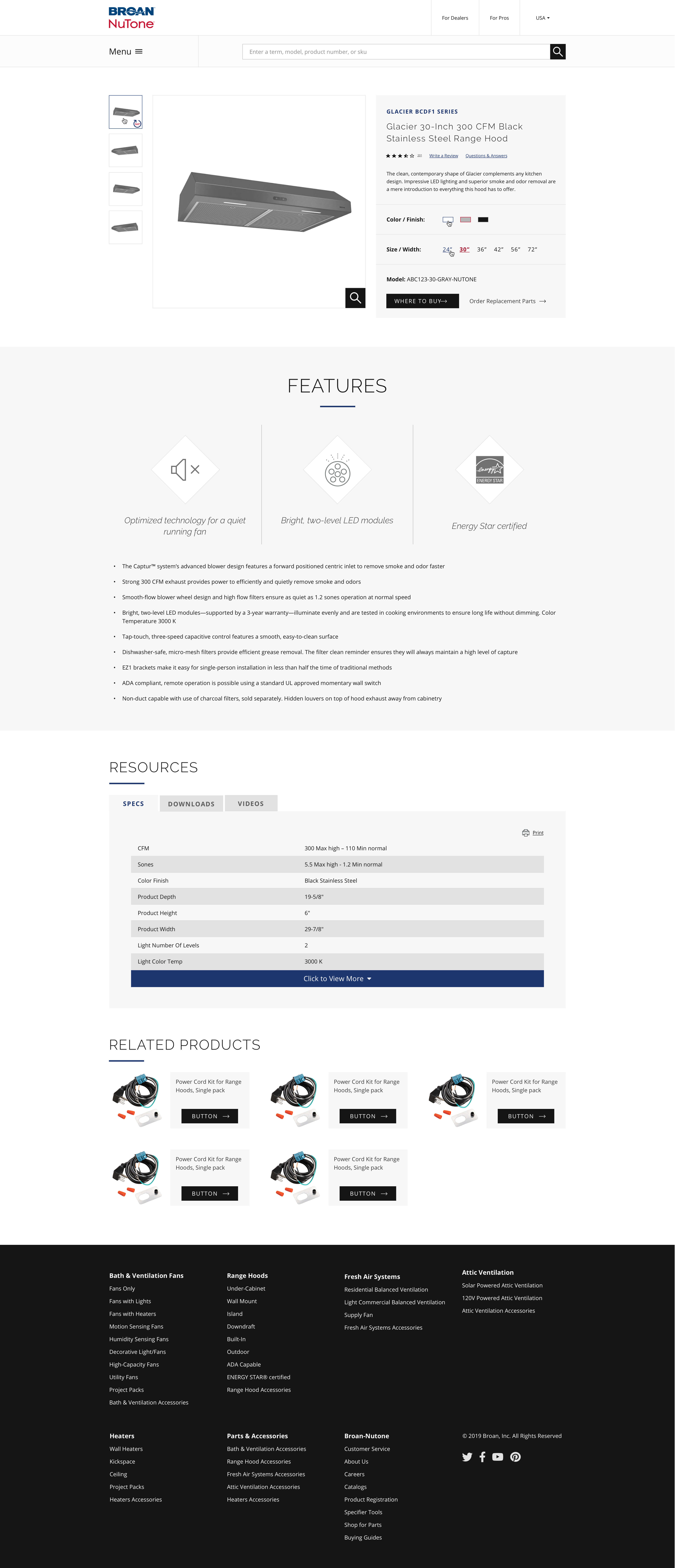
Product Details
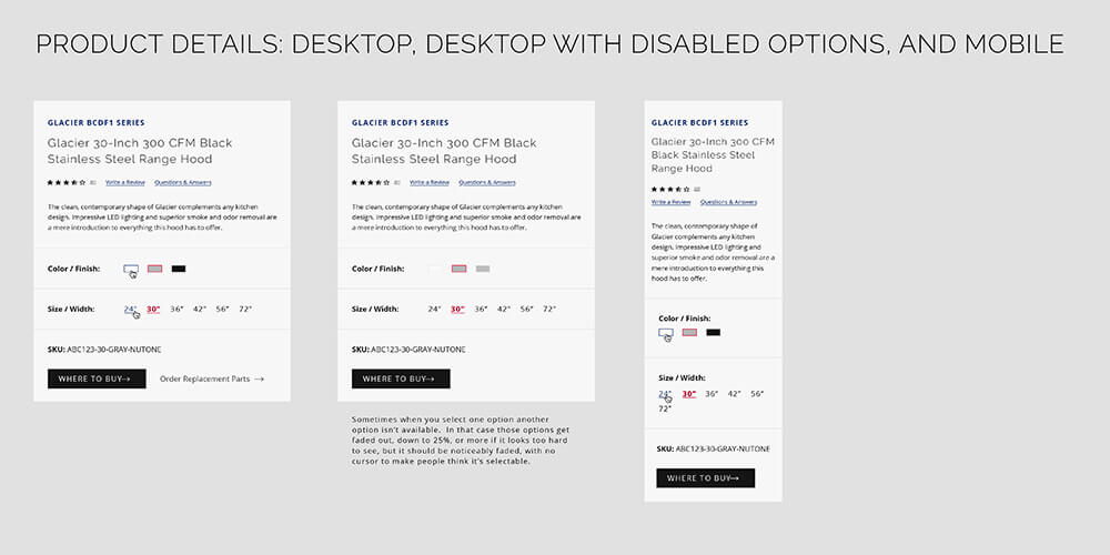
The product details page is fairly straight forward, with a tabbed interface to view more information, and a table that can collapse and be opened if there are a large amount of specs.
The Process
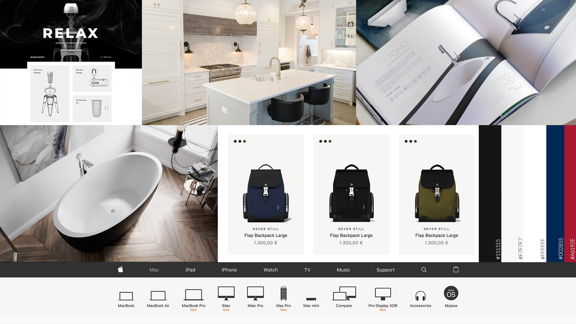
Moodboard
Components
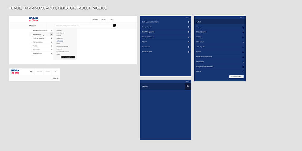
The site was built with modularity in mind: almost every part made can be used elsewhere. So I created a library of all the components, including their tablet and mobile versions. Here are a choice few:
