AGI
Overview
A complete refresh for a company that makes advanced software for engineering simulation.
Challenge
The client came to the company I was working for wanting to do an overall of their website. They felt their then current design was too on the nose, dark, and wasn't delivering their information efficiently.
Solution
We pitched to them a website rebrand that mixed a light and dark aesthetic to give both a more corporate feel but with a touch of the void of space.
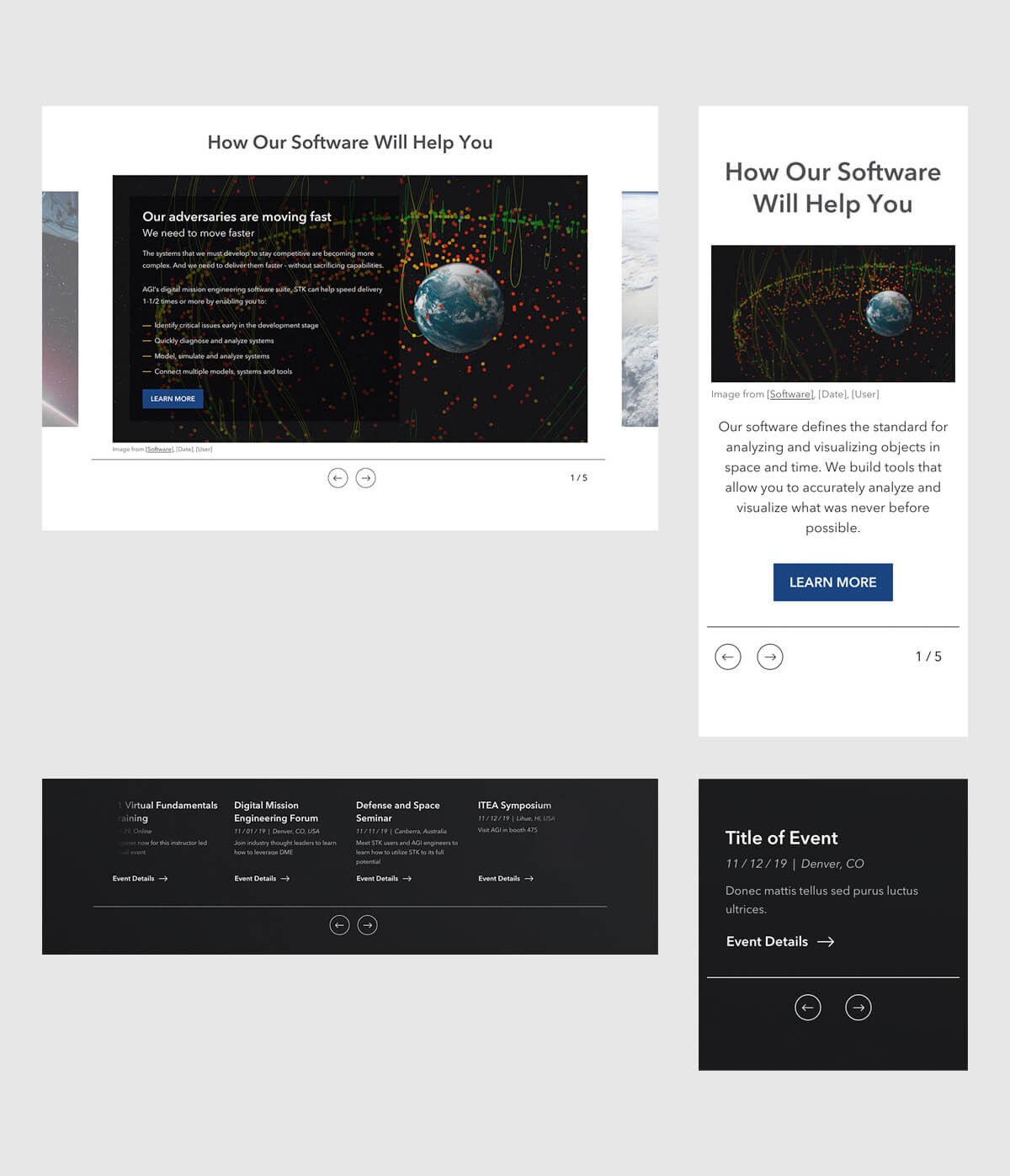
The homepage was greatly expanded with more info and options for delivering it, with new mega menus for easier discover. Being a modular site, all components can be added or removed on any of its pages.
Deliverables
Comparison
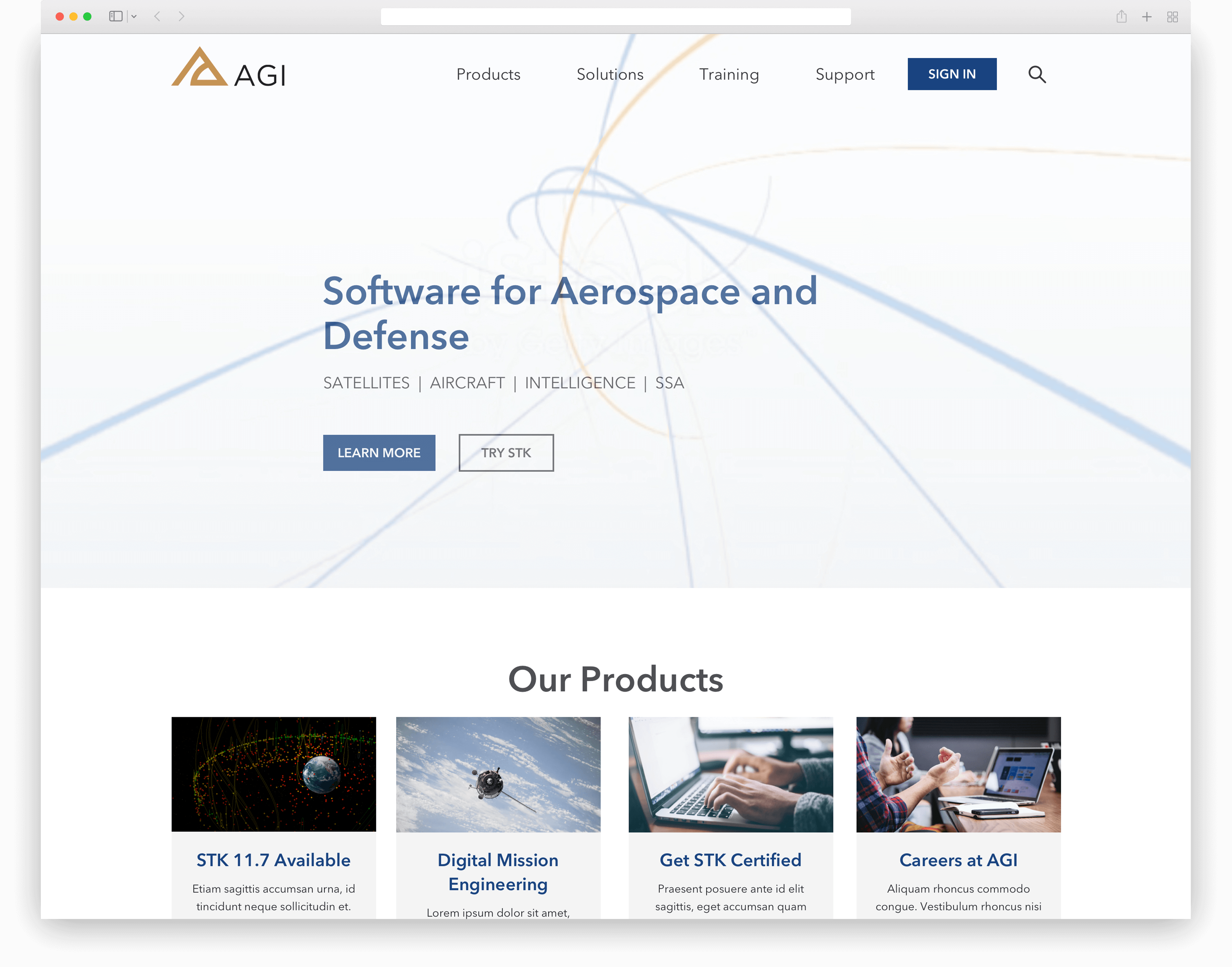
Homepage
The opening draw of the site was originally pitched as a webgl project of abstract lines either traveling in an arc or intricate way to suggest a global or intricate networking of ideas, somewhat like the found stock video below. It was ultimately changed to a video from the company's collection for better cost.
View the full homepage design including a suite of components:
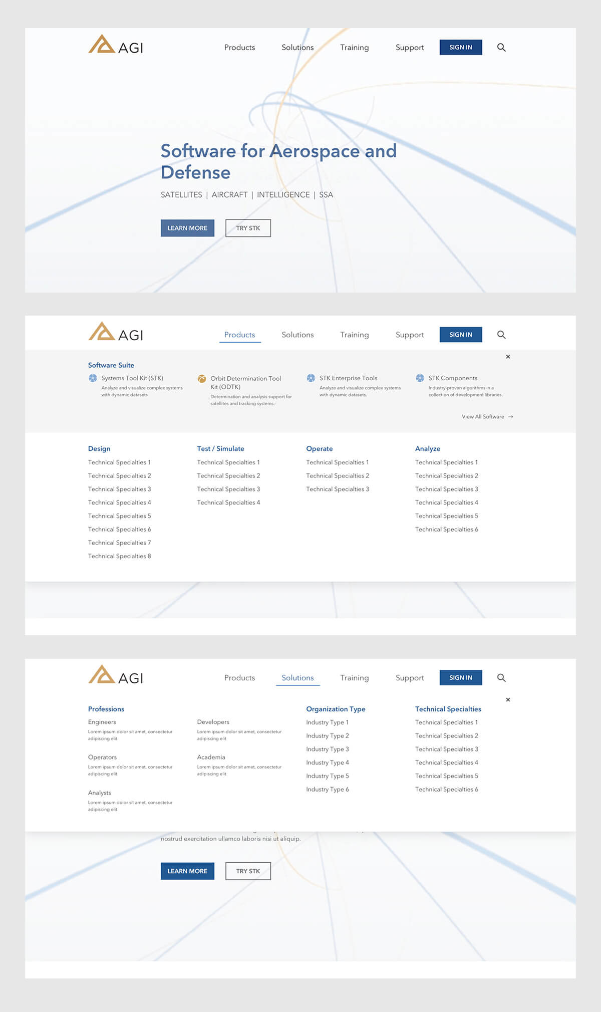
Product Page
The product page is both a selling point and a place for existing clients to look for help or training for a specific product.
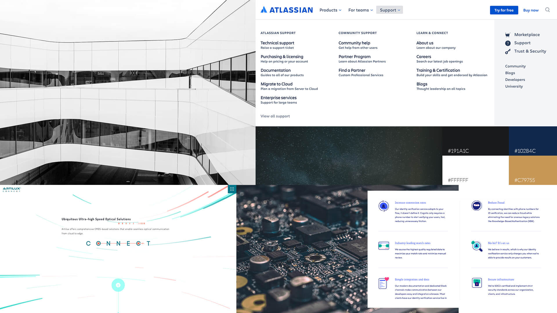
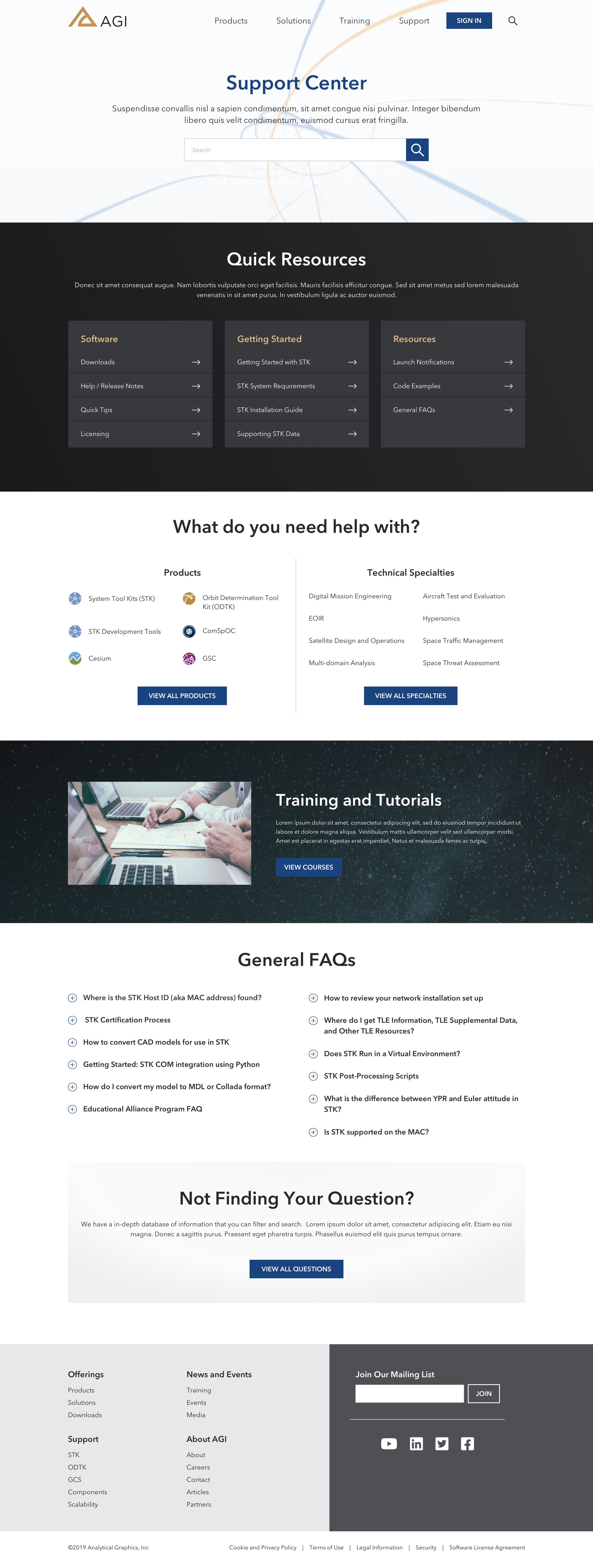
Support Page
A fairly typical support page, but designed with more direct options in mind.
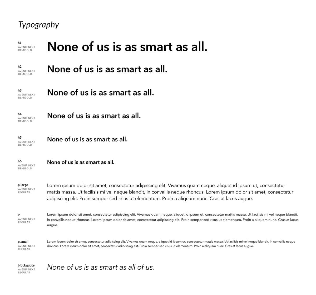
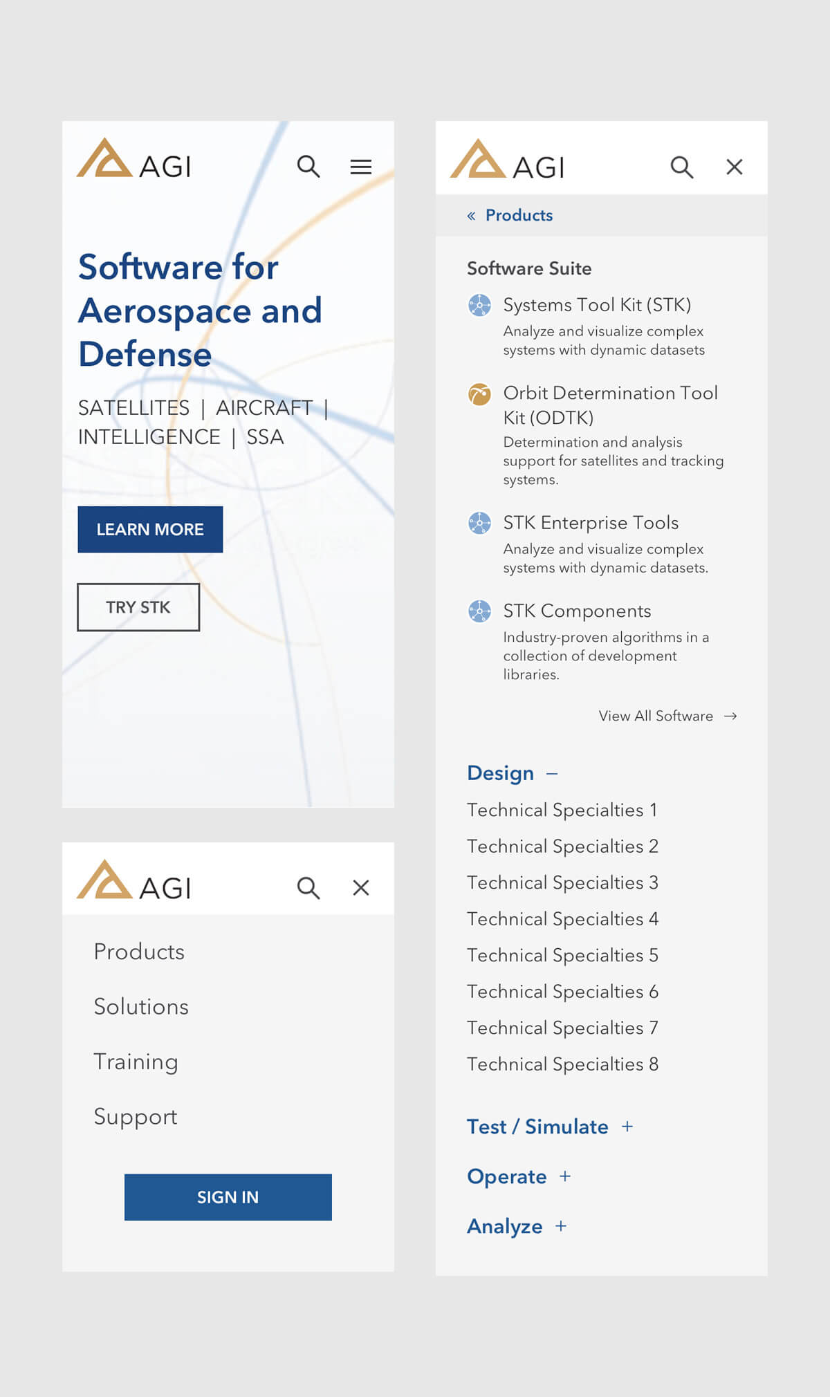
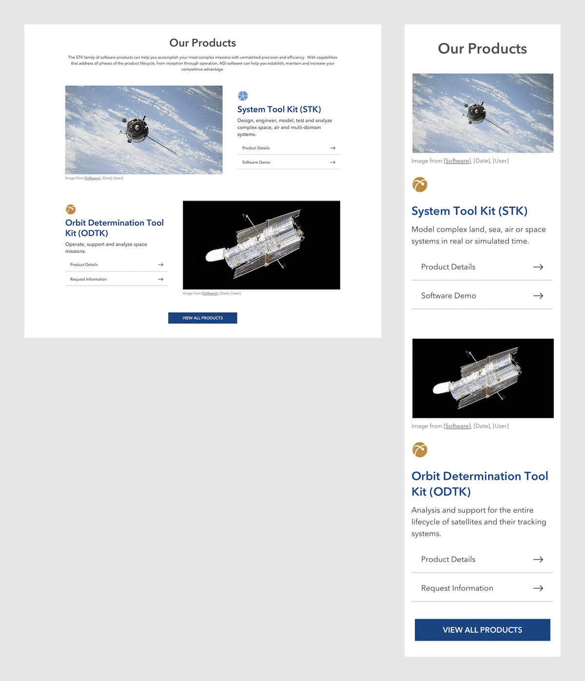
Components
The site was built with modularity in mind: almost every part made can be used on another page. I created a library of components, including their mobile versions and any special interactions they may have. Here are a choice few:
The Process
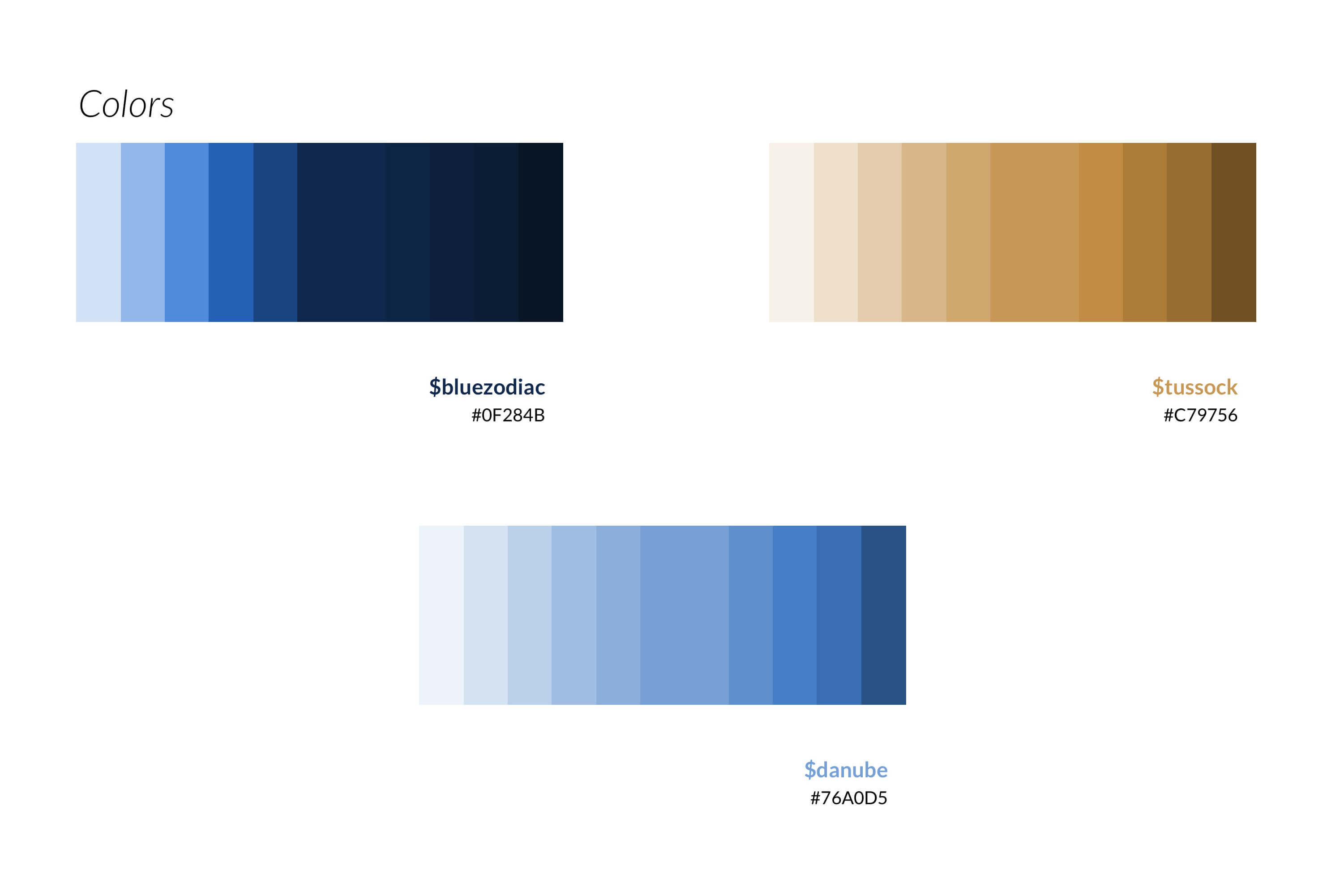
Moodboard